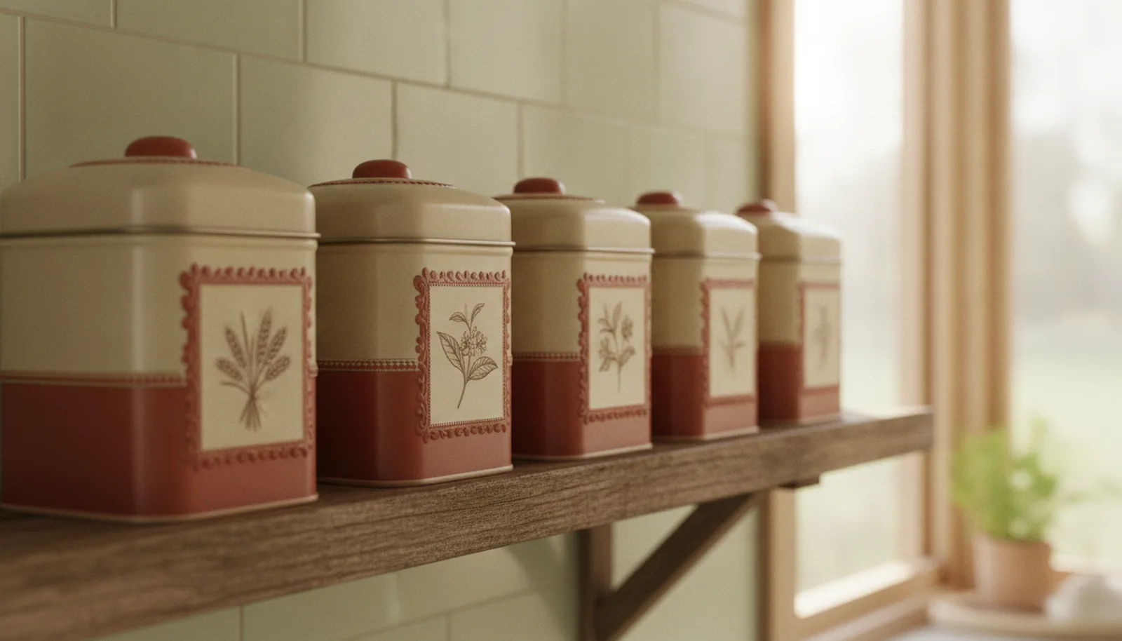
If you've ever opened a biscuit tin and found buttons, thread or a stack of old photographs where the biscuits used to be, you already understand the commercial case for retro tin packaging. The tin outlived its contents — and in doing so, it became somewhere memory lives. That's a strange thing for a package to do, and it's the reason a well-judged retro tin can accomplish something most minimalist designs don't set out to: make a shopper feel something before they've read a single word.
We'll say up front what this article can and can't claim. Nobody we know of has published clean, head-to-head sales data comparing retro tins with minimalist ones on the same shelf, and we'd be wary of anyone who says they have. What exists is a solid body of psychology, some useful brand research, and a long manufacturing history. Together they make a strong argument — just not a statistical one.
What nostalgia actually is, and why it sells
Nostalgia is not a mood board. Psychologists describe it as a predominantly positive but bittersweet emotion, a blend of fond memory and longing that usually centres on childhood, close relationships or unusually good moments. It's triggered by sensory cues — music, smells, tastes, objects from childhood — and also by discomfort: loneliness, boredom, or a feeling of disconnection between past and present. What it gives back is a stronger sense of being connected to other people and of life being meaningful. A package that carries the right cue is doing real emotional work.
Whether that work translates into spending is a fair question. In a 2014 paper in the Journal of Consumer Research, Lasaleta, Sedikides and Vohs found that nostalgia loosened people's grip on money, partly by making them feel more socially connected. In one of their experiments, participants who viewed a nostalgic ad were willing to pay more for a range of products, according to the authors. The samples were small, they were mostly students and online panels, and no real purchases were observed — so read it as a mechanism, not a forecast.
The brand-side evidence is more practical. Ipsos found that using brand history or heritage in advertising lifted brand attention by 8%, while only about 10% of global ads used it. That is advertising, not packaging, and we wouldn't stretch it further than that. But it does suggest that heritage cues are underused, not saturated.
Mintel's 2026 food and drink predictions give the trend a name — "retro rejuvenation" — and an important caution: nostalgia isn't about rewinding to one specific year. Brands, in Mintel's framing, act as custodians who preserve or modernize traditional ideas. That distinction matters for design, and we'll come back to it.
Why tin is the package people keep
Tin has been a keepsake for a long time. The V&A's history of biscuit tins dates its earliest decorated example to 1868: 'Ben George', commissioned by Huntley & Palmers, designed by Owen Jones and printed by Benjamin George using transfer printing. In 1877, Huntley, Boorne & Stevens acquired exclusive rights to offset lithography, which let makers print more colours with tighter registration — the same family of process behind the lithograph printing we run today.
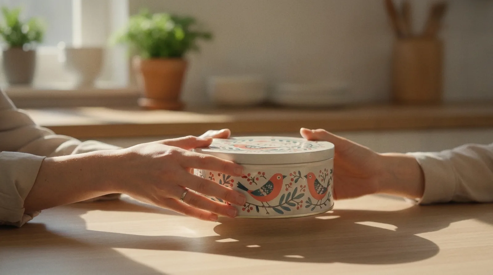
The more telling detail is what the makers intended. The V&A notes that Christmas tins were designed to be kept after the season, and that many tins found second lives as toys, storage and home decoration. Its collection now holds more than 800 tins made between 1868 and 1939. Victorian manufacturers weren't just selling biscuits; they were selling an object designed to outlive them. A carton usually leaves the house with the recycling. A tin has a documented history of staying (see how it compares in our tin vs cardboard guide).
One more fact from the same source is worth sitting with: decorated tins never fully recovered after the Second World War, though they're still made, especially at Christmas. That makes the elaborate tins of the earlier era a finished chapter of packaging history, which is part of what gives a faithful homage its charm — and part of why a homage should feel chosen, not copied.
Retro tin packaging is not one look: three levers
"Retro" gets used as if it's a single style. It isn't, and the brands that do it well pick their levers deliberately.
Typography
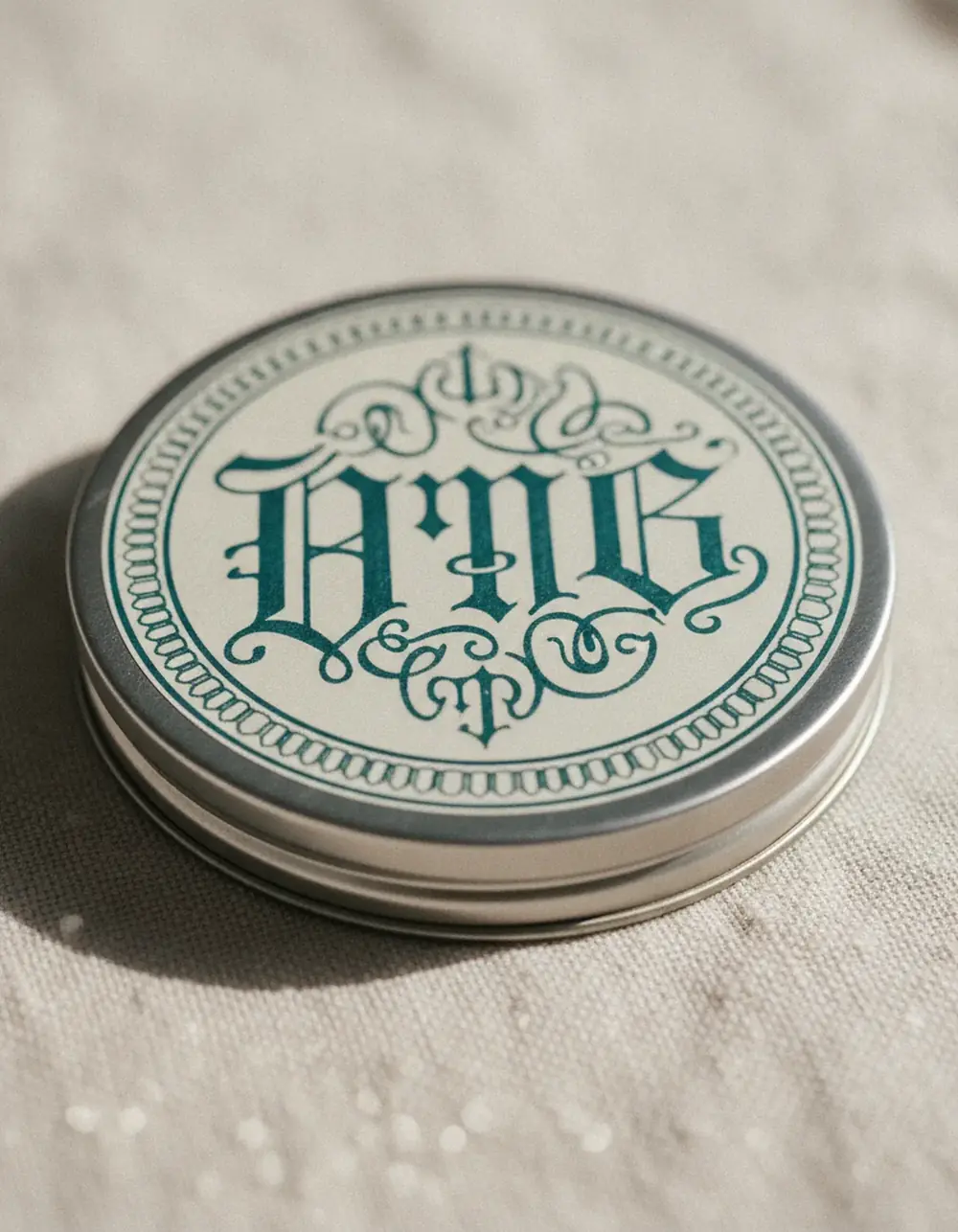
Lettering carries the era faster than anything else. Display serifs, script wordmarks, outlined and shadowed capitals, and hand-lettered logotypes all say old before the reader processes a word. On metal, test the finest strokes — thin hairlines and tiny serifs are the first places we ask designers to look in a proof. Samples from existing molds typically take 10 to 14 days, which is a short price for catching a weak stroke before the full run.
Colour, print and surface
A retro palette often means restraint: two or three Pantone (spot colour) inks rather than a full photographic range, muted reds, teals and mustards, and cream where a modern design would use white. On tinplate, that cream is built with a white print layer under the colour, or the bare metal is left to read as silver. Both choices are available in our lithograph printing, which is full-surface CMYK offset lithography with Pantone matching, and which one you pick changes the whole feel of the lid.
Illustration follows the same logic. Ornamental borders, engraved-style drawings and label-shaped panels evoke the era; so does embossing, which adds the tactile relief that printed paper can't. Our tooling reaches roughly 1mm of embossing precision, enough for a raised border to catch light the way an old stamped tin would. If you're weighing raised against recessed, our guide to embossing vs debossing on tin walks through it, and the tin finish guide covers gloss, matte and everything between.
Shape
Shape was part of the original sales pitch. The V&A's catalogue includes tins made as baskets, a windmill with spinning sails (1924) and a lifeboat with removable wheels (1925). Novelty was the point — the tin was a toy as well as a container.
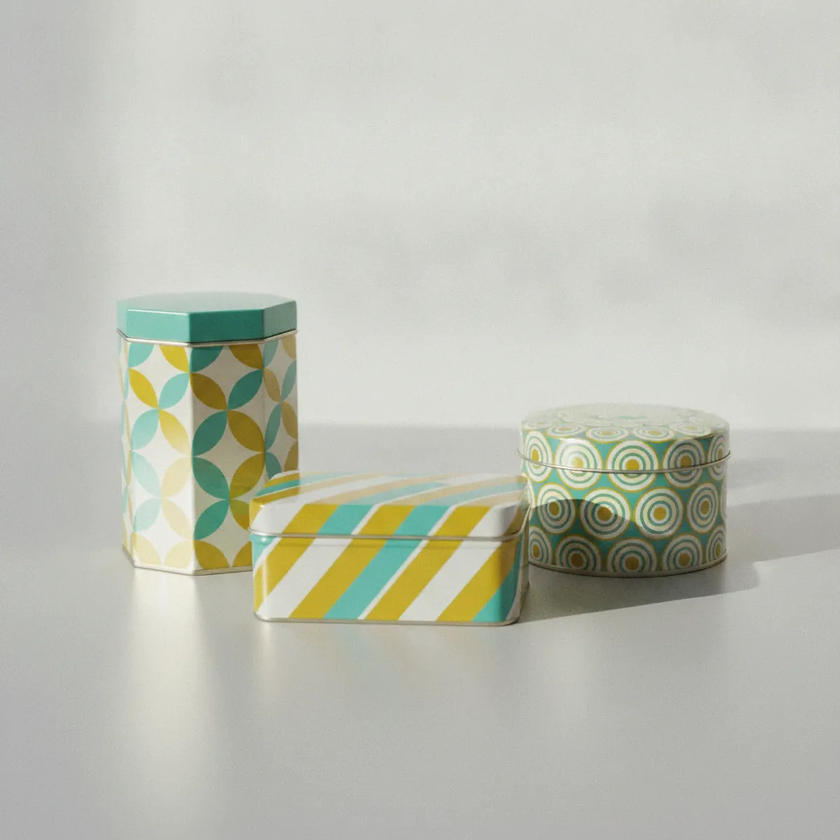
Today, the practical route is to begin with what already exists. We hold more than 5,000 molds, and an embossing tool can be added to an existing mold: the tool has a cost, but using the mold itself doesn't. A new mold adds 4 to 6 weeks of tooling and makes sense when the shape is the story. Browse the tin gallery before committing, and see our design and innovation service when a custom shape is the goal.
Doing retro without looking dated
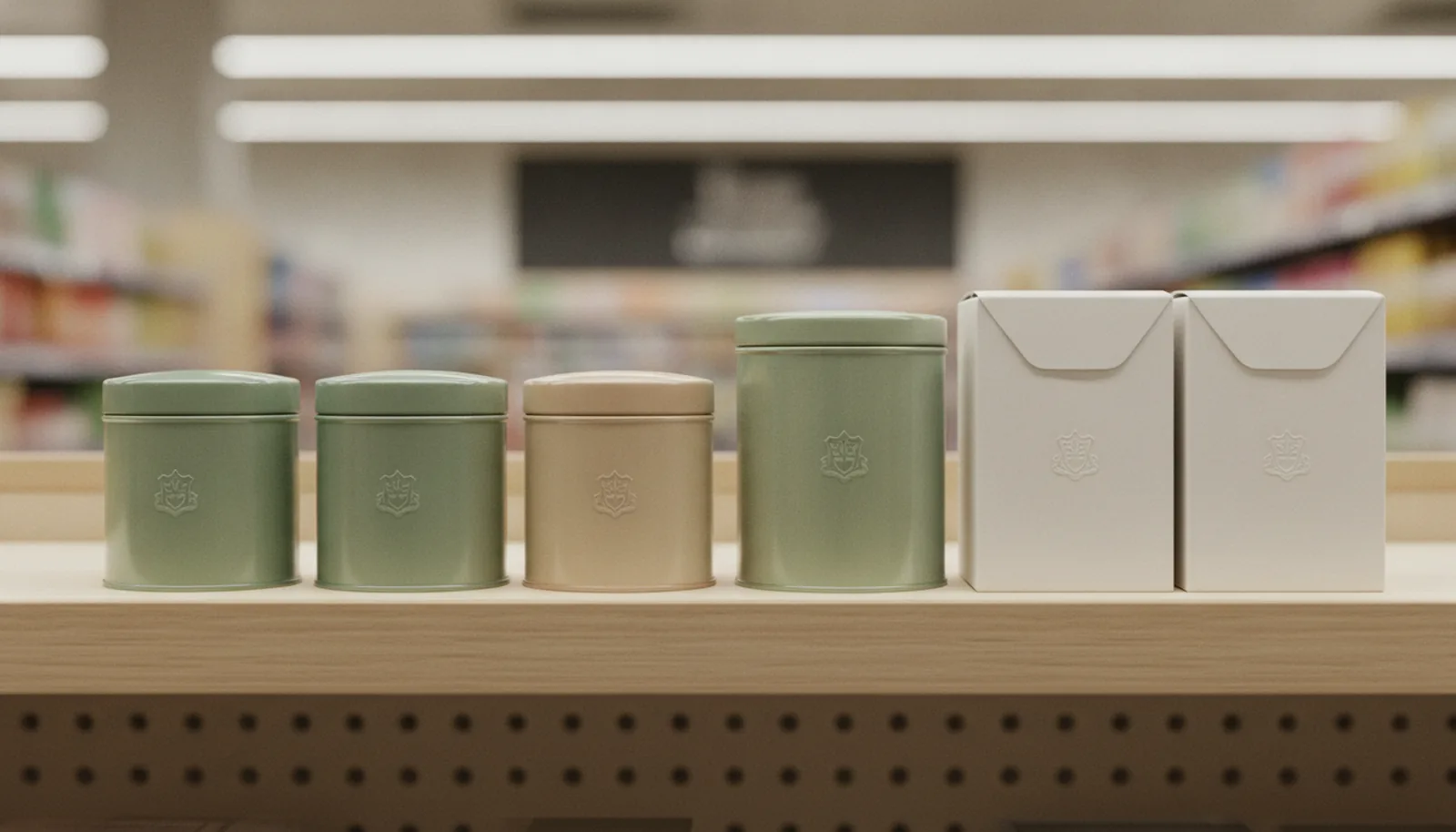
The risk with nostalgic design is obvious: it can slide from warm to costume. Three habits help.
Pick one memory, not a whole decade. Mintel's point that nostalgia isn't about a specific era applies directly. A tin that uses a 1950s script, a 1970s palette and Victorian ornament reads as confused. One era's cues, applied with discipline, reads as confident.
Keep the information modern. Hierarchy, legibility, claims and certification marks should feel current even when the lettering doesn't. People are happy to be charmed by the surface; they still need to find the flavour name in two seconds.
Be honest about heritage. If your brand started three years ago, we'd steer you toward inspired by visual language rather than an invented founding date. Real stories are easier to defend, and they pair well with the regional approach we covered in cultural storytelling through tin — that piece is about place, and this one is about time, and the two can work together.
Retro and minimalism aren't enemies
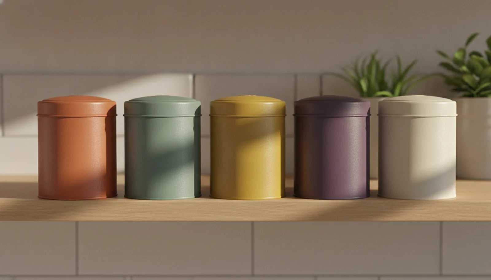
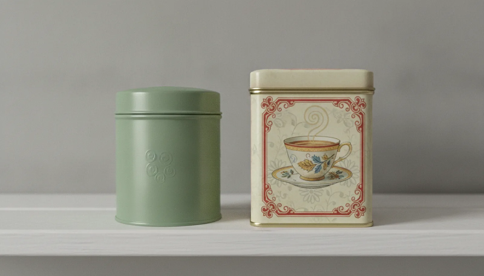
It would be easy to frame this as a fight. It isn't one. Our own quiet luxury piece argues that restraint on metal can signal confidence, and that's still true. Many of the best retro tins are restrained in their own way: two inks, one border, one wordmark. Minimalism tends to win where the brand's promise is clinical, technical or understated by nature. Retro tends to win where the promise is comfort, gifting, ritual or a story that's older than the product. The question isn't which style is better; it's which memory — or absence of one — your customer should walk away with.
A short brief for a retro tin
Before you contact a manufacturer, settle five things: the memory you want to evoke, the single era or reference you'll draw from, the one hero element (lettering, border, illustration or shape) that carries it, the finish, and the shelf date.
Then work backward from that date. Existing-mold projects typically quote at 8 to 16 weeks in total and new-mold projects at 12 to 22 weeks, depending on how far the customer is from the factory; allow extra time for artwork rounds. The minimum order is 3,000 pieces on every project, and it can be split across three or four designs in equal quantities, which suits a range that wants a lead tin and a few variations. We'd suggest ordering a year's quantity at once. Holiday tins show why the calendar matters most: a tin briefed in late October lands in mid-December at best, which is too late for most holiday shelves. For Christmas, the brief belongs in spring.
If the product is a gift or a pantry staple, our industry pages for cookie tins, coffee and tea tins, chocolate tins and candy and snack tins show how these decisions land in practice. All paints and coatings we use are food-grade.
Stannum Can has been making decorative tins since 1993, and our in-house design studio works with brands on everything from a single embossed border to a fully custom form. If you have a tin in mind — or only a memory you'd like to turn into one — the contact page is the place to start.
Frequently asked questions
What is retro tin packaging?
It's tin packaging that uses design cues from an earlier era — period typography, limited colour palettes, ornamental borders, embossed detail or novelty shapes — to evoke familiarity and warmth. It can be a faithful homage or a contemporary reinterpretation.
Does nostalgic packaging actually sell more?
The evidence supports the mechanism more than the outcome. Research shows nostalgia increases feelings of connection and, in lab settings, willingness to pay, while Ipsos finds heritage cues raise attention in advertising. We're not aware of controlled shelf-sales data for tin specifically, so treat claims of a guaranteed uplift with caution.
Do I have to choose between retro and minimalist design?
No. Restraint and nostalgia overlap often: a two-colour palette, one border and a hand-lettered wordmark is both. Choose based on the feeling your product promises.
Can a newer brand credibly use retro design?
Yes, as long as it doesn't invent history. Use period-inspired lettering and colour as a style, and let your real story do the heritage work.
What are the MOQ and lead time for a custom retro-style tin?
The MOQ is 3,000 pieces on every project, which can be split into three or four designs in equal quantities. Total lead time to quote is 8 to 16 weeks with an existing mold and 12 to 22 weeks with a new one, depending on distance from the factory.
References
1. Sedikides, C., Wildschut, T., Routledge, C., Arndt, J., Hepper, E. G., & Zhou, X. (2015). To Nostalgize: Mixing Memory with Affect and Desire. *Advances in Experimental Social Psychology*, 51.
2. Lasaleta, J. D., Sedikides, C., & Vohs, K. D. (2014). Nostalgia Weakens the Desire for Money. *Journal of Consumer Research*, 41(3), 713–729.
3. Victoria and Albert Museum. Biscuit tins: a bite-sized history.
4. Ipsos & Effie UK (2024). Why nostalgia is so fetch right now. *Dynamic Effectiveness*, Vol. 3.
5. Mintel (2025). 2026 Food and Drink Predictions.