# The Color Playbook for Printing on Tin: How Metal Changes the Rules
If you've ever approved artwork on a bright monitor — or on a paper proof — and then opened the carton of finished tins to find your brand blue looking deeper, glossier, and somehow more alive than you signed off on, you've met the single most important fact about printing on tin: the substrate is part of the design. Color choices carry real commercial weight — one widely cited review in Management Decision found that people form judgments about products within about 90 seconds, and that 62–90% of that assessment rests on color alone. Which colors to reach for is its own question, and one we've worked through in the psychology of color in metal packaging. This piece is about the layer underneath it: what the metal does to whatever palette you pick. Because nearly everything written about packaging color assumes a white, absorbent surface underneath the ink. Tinplate is neither. It's silver, it's reflective, and it doesn't absorb a thing — which means the rules brand teams have internalized from paper and cardboard quietly stop applying the moment the job moves to metal.
That's not a problem to be managed. Handled deliberately, it's the reason a printed tin can do things a printed carton physically cannot. This is a practical playbook for how color actually behaves on metal — the white base coat, transparent inks, raw-metal show-through, and interior printing — so the tin that arrives matches the tin you imagined.
Why paper rules don't transfer to metal
On paper or board, ink soaks in. The fibers drink a little of it, the white of the stock lifts it from behind, and the surface scatters light softly in every direction. That diffuse scatter is why a printed carton looks roughly the same from most angles.
Tinplate does the opposite on every count. Ink can't soak into metal, so it sits on the surface as a thin, even film. And instead of scattering light, polished tinplate reflects it — closer to a mirror than a page. Light passes through the ink film, bounces off the metal beneath, and comes back through the ink a second time. The practical result is that the same ink formula reads differently on tin than it does on paper: often deeper, often with a luminosity that paper can't produce, and always more responsive to the angle of the light. On a curved tin body this is amplified — a cylinder shows you the highlight and the shadow of the same color at the same time, something a flat carton face never does.
None of this is a defect. It's the material behaving like metal. The design question is simply where you want that behavior and where you don't.
Printing on tin: what actually happens when ink meets metal
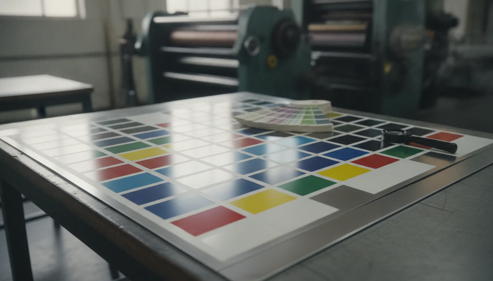
The first decision in any tin print job — made long before the offset lithography press runs — is where to lay down an opaque white base coat. Because the sheet starts out silver, printing white first is how you give CMYK inks the same footing they'd have on paper stock. Over that white base, process colors behave predictably: your coral reads coral, your sage reads sage, and photographic imagery reproduces the way your designer expects.
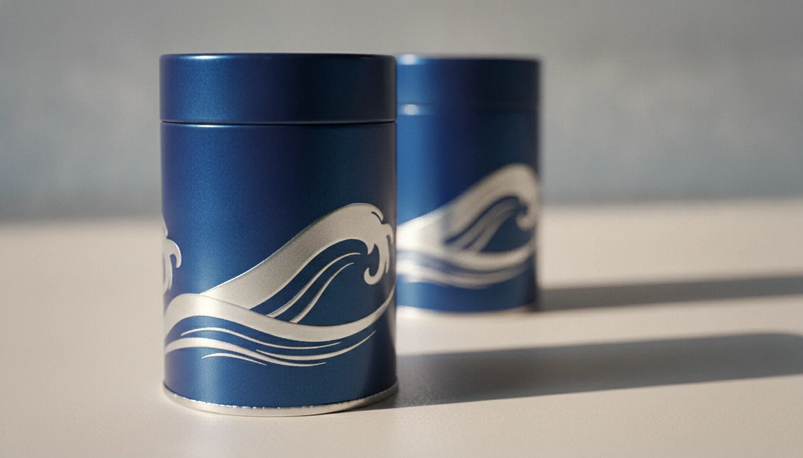
Where the artwork skips the white base, everything changes, because standard process inks are transparent by design. Print transparent ink directly on bare tinplate and the metal shines back through it — the color goes darker, richer, and unmistakably metallic. This is exactly how most gold on tins is achieved: not with gold ink, but with a transparent amber-yellow printed straight over the polished metal. The tin supplies the shine; the ink supplies the hue. Cardboard has to fake this effect with foil stamping — a separate die, a separate pass, and a separate line on the invoice — which is one of the quieter advantages tin holds in the tin versus cardboard comparison. On tin, the metallic is already there, waiting under the ink.
So a single printed tin sheet really carries three kinds of color: opaque color over the white base, metallic color where transparent ink meets bare metal, and the untouched tinplate itself. Learning to compose with all three is the core skill of tin packaging design.
The fifth ink you get for free
Think of raw metal as a fifth ink that costs nothing. Anywhere the artwork "knocks out" — leaves both the white base and the ink layers unprinted — the polished tinplate becomes the design element. A wave, a monogram, a pinstripe, a full mirror-finish lid: these read as intentional, engineered details, and they photograph beautifully because they respond to light in a way flat ink never will.
There are placement judgments to make, and they're worth making early. Fine bare-metal linework needs the same registration care as any fine detail, and the tin packaging die-line tells you where seams, curls, and embossing will interact with it — a knockout that drifts into a rolled edge stops looking deliberate. And bare metal is honest: it shows fingerprints and scuffs more readily than a printed, varnished surface, which is why full bare-metal panels usually get a clear gloss varnish over top. The metal still shines through; the varnish just takes the maintenance burden off your customer.
The larger point is one of restraint. One well-placed metallic element against confident flat color almost always outperforms metal everywhere. We've seen a plain deep-green tin with nothing but a bare-metal band at the shoulder outsell far busier designs — the contrast is the luxury cue, not the quantity of shine.
CMYK, Pantone, and keeping brand colors honest on metal
For photographic artwork and layered illustration, CMYK over a white base is the workhorse, exactly as it is on paper. The place to slow down is brand-critical color — the exact red on your logo, the specific blue your buyers recognize across every touchpoint. Process builds of those colors can drift subtly from sheet to sheet, and the metal's reflectivity makes any drift easier to notice. For those elements, spec a Pantone spot color — a pre-mixed ink matched to a target shade — and flag it as brand-critical in your artwork handoff. Full-surface CMYK with Pantone matching is standard on a modern tin line, so this is a specification decision, not a cost bombshell.
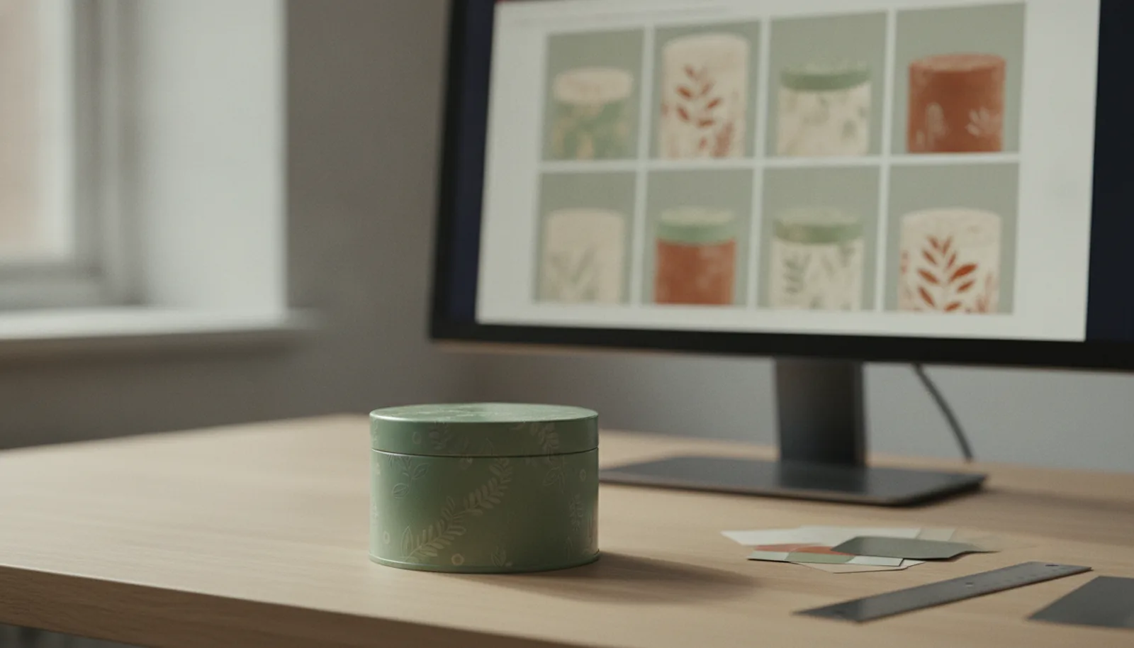
The second discipline is proofing on the real substrate. A monitor is backlit and a paper proof sits on white stock; neither can show you what a transparent ink does over silver metal, or how your palette behaves on a curve. Ask for a printed drawdown or wet proof on actual tinplate before you approve production — it's a routine request, and it's the single cheapest insurance in the entire job. Guesses in manufacturing rarely end well, and color guesses are no exception.
One more honest note: very pale tints are the hardest colors on metal. A 5% blush that whispers on paper can nearly vanish over a bright white base coat, or shift character entirely over bare metal. If a barely-there pastel is central to your identity, that's a conversation to have with your supplier's design team at the concept stage, not at the proof stage.
Printing the inside: the surface cardboard forgets
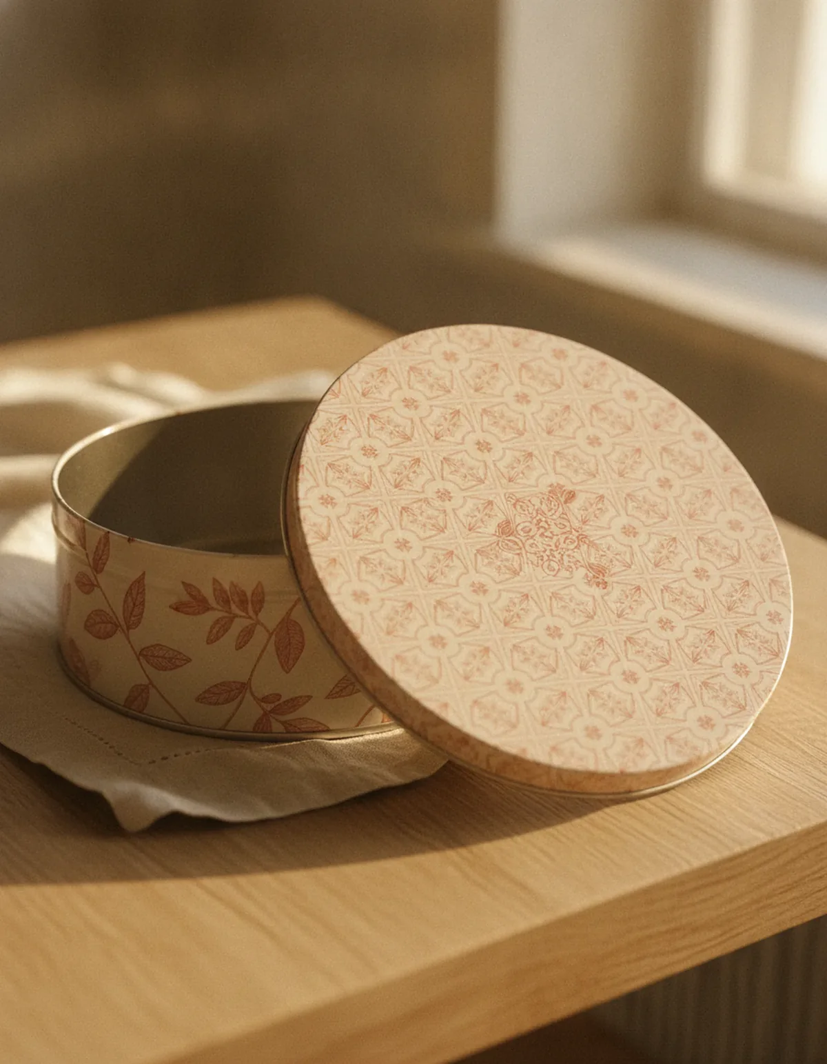
A folding carton is opened once, then flattened. A tin is opened hundreds of times over years of reuse — and every single open shows your customer the inside of the lid. Printing that interior surface is one of the most underused moves in tin design: a pattern inside the lid, a message on the inner base, a full inside-and-out print that makes the container feel considered from every angle. We field requests for exactly this from brands as different as confectioners and collectible makers, and it consistently turns an ordinary open-and-close into a small brand moment.
Two production notes keep this simple. First, the coatings question. All the paints and coatings we use are food-grade, and Stannum Can holds BRC certification for indirect food contact — which is the specification most food tins actually want. The reason we steer brands toward indirect contact isn't a safety ceiling; it's flavor. Bare metal can impart a faint metallic note to certain sensitive products over a long shelf life, so the standard construction keeps the product in an inner wrapper, pouch, or liner and lets the tin do the protecting from one step back. Where a product genuinely needs to sit against the container — a wet, acidic, or oily fill — the answer is an interior lining specified for that purpose, the same principle used in tomato tins and other processed-food cans. Tell us the fill early and we'll scope the right construction.
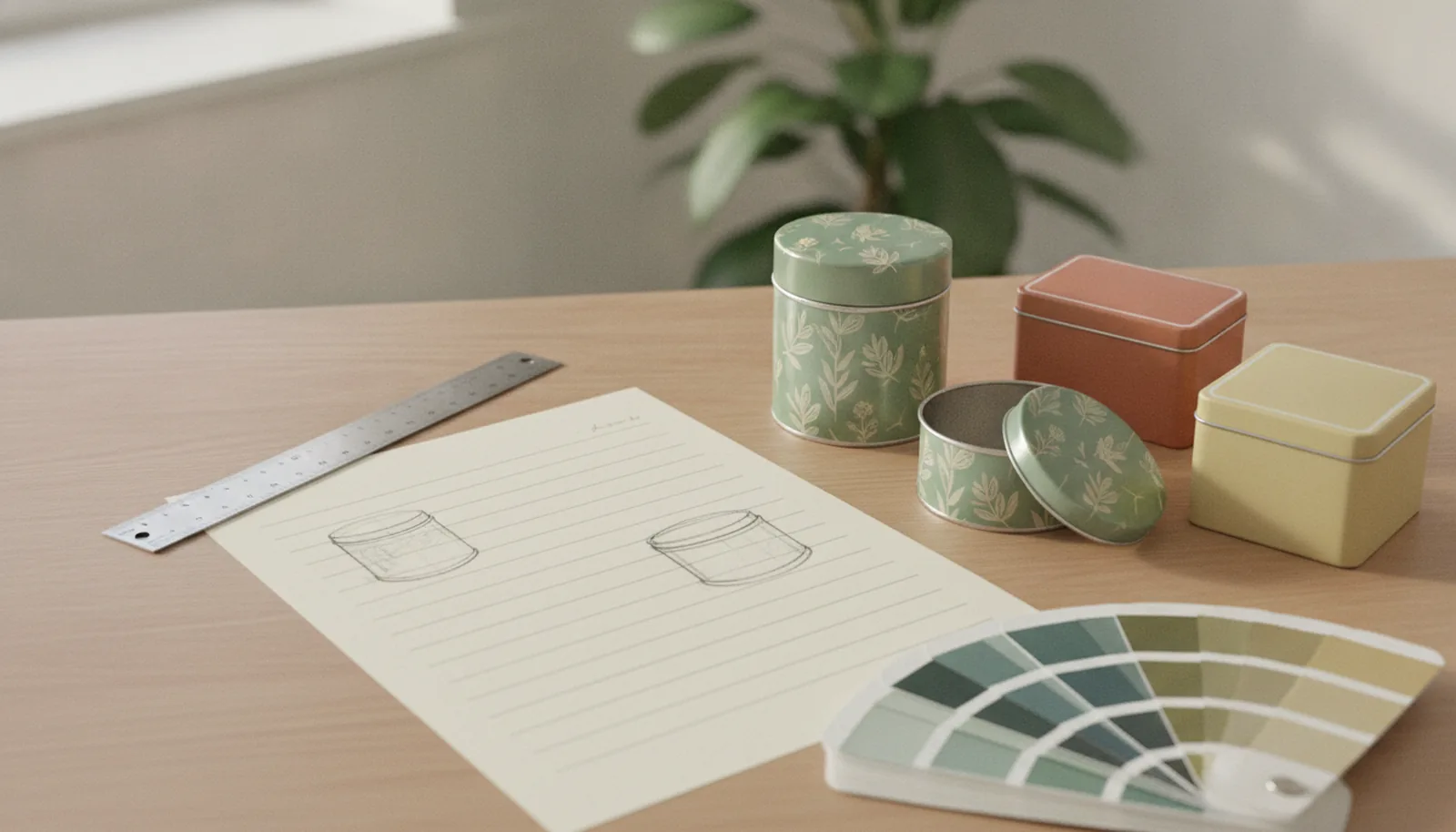
Second, the same white-base-versus-bare-metal logic applies inside: a gold-toned interior (transparent ink over metal) is a classic move for chocolate and tea tins because it flatters the wrapped or pouched product sitting in it, while an opaque printed pattern gives you full graphic control. Either way, the interior belongs on your die-line from day one, not as an afterthought once the exterior is approved.
Color and finish decide the result together
The last variable is the one most teams choose too late: the finish. A gloss varnish amplifies everything this article describes — deeper darks, brighter metal show-through, stronger highlights on the curve. A matte varnish does the opposite, softening the metallic behavior and pulling the palette toward the calm, velvety territory that quiet-luxury brands favor. Satin sits between. The same artwork under gloss and under matte can look like two different products, which is why finish belongs in the color conversation from the start; our guide to choosing the right tin finish walks through those trade-offs in detail. Embossing joins the same conversation — raised metal catches light along its edges, so an embossed logo over bare metal effectively adds its own highlight color to the palette.
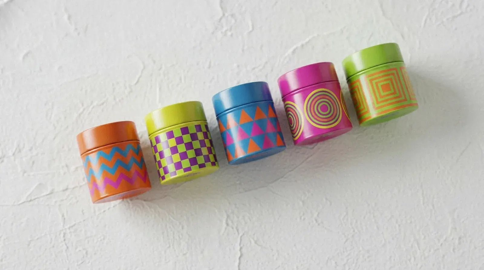
If your audience skews younger and your palette louder, the interplay works in your favor too: saturated brights over a white base, cut with bare-metal accents, is a combination we explored in our look at designing tins for Gen Z — flat color does the shouting, the metal does the winking.
Before your artwork goes to press
The playbook condenses to a handful of decisions, best settled before the die-line is populated rather than after. Decide which areas print over the white base and which run over bare metal, and mark both explicitly in the artwork. List the brand-critical colors that need Pantone spot matching rather than CMYK builds. Choose the finish alongside the palette, not after it. Put the interior surfaces on the die-line if they'll be printed. And approve a proof on real tinplate — never only on screen or paper — before releasing production.
Handled this way, the metal stops being a variable to fear and becomes the most distinctive tool in the palette: a surface that paper-based packaging spends extra money trying to imitate, and never quite does.
Stannum Can has been printing on tinplate since 1993, with full-surface offset lithography, Pantone matching, and food-grade coatings across 5,000+ existing molds. If you're working out how your brand colors should behave on metal — or want a drawdown on real tinplate before you commit — talk to our team and we'll walk the artwork with you.
Frequently asked questions
Can you print white on a tin?
Yes — white is usually the first thing printed. An opaque white base coat gives CMYK inks a paper-like foundation on the silver sheet, and white also works as a design color in its own right. The artwork decides where the white goes and, just as importantly, where it doesn't, since unprinted areas let the bare metal show through.
Why doesn't gold on a tin cost extra the way foil stamping does?
Because on tin, the gold usually isn't a separate process. It's transparent amber-yellow ink printed directly over the polished tinplate — the metal provides the shine, the ink provides the hue, and it runs in the same lithography pass as the rest of the artwork. Foil stamping on cardboard requires a separate die and press pass, which is where its added cost comes from.
Will my exact brand color match on metal?
Brand-critical colors should be specified as Pantone spot colors rather than CMYK builds, and approved on a proof printed on actual tinplate. Metal's reflectivity makes small color drift more visible than paper does, so the combination of spot inks and substrate-accurate proofing is how tight matches are held in production.
Can the inside of a tin be printed, and is it food-safe?
Interior lids, walls, and bases can all carry print. All paints and coatings we use are food-grade, and we hold BRC certification for indirect food contact — the specification behind most cookie, chocolate, tea, coffee, and confectionery tins, where the product sits in an inner wrapper, pouch, or liner. That recommendation is about flavor rather than safety: bare metal can lend a faint metallic note to some sensitive products over a long shelf life. For fills that must sit directly against the container, we specify an interior lining designed for direct contact — the same approach used in tomato tins. Either way, include the interior on the die-line from the start so print, registration, and coatings are planned together.
Do metallic effects or bare-metal areas affect recyclability?
No. Whether a tin is fully printed, partially bare, or finished with varnish, it recycles in the ordinary steel stream — coatings and inks are removed during remelting. The metallic look comes from the tinplate itself rather than from added foils or laminates, which is part of why tin keeps its recycling story simple.