If you've spent any time recently looking at what's moving in the gift, food, or beauty aisles — or more likely, what's going viral on TikTok — you've probably noticed that packaging has gotten louder. Not louder in a "discount sale" kind of way. Louder in a way that feels intentional, culturally specific, and almost aggressively photogenic. That's not an accident. It's Gen Z.
This generation — roughly those born between the late 1990s and early 2010s — is no longer an emerging demographic to plan for someday. In the U.S. alone, Gen Z already commands $360 billion in buying power, up from $143 billion just four years ago. Their global spending power is projected to reach $12 trillion by 2030. And crucially, they are making purchasing decisions in ways that their predecessors never did — with packaging playing a starring role.
This post is about what that shift actually means for brands thinking about tin packaging: the specific design trends reshaping shelf appeal, why metal is one of the best surfaces available for executing them, and how Stannum Can's printing capabilities and shape library make tins a natural home for the Gen Z aesthetic.
Why Packaging Hits Different for This Generation
There's a phrase worth internalizing here: for Gen Z, packaging is not just a container. It's a prop, a signal, a social artefact. For this generation, packaging is also a TikTok video, a fridge restocking reel, an unboxing moment shared with 50,000 followers, and a visual prop in a flat lay. The design brief, in other words, has expanded well beyond "looks good on a shelf under fluorescent light." It now includes "reads at thumbnail," "performs on camera," and "rewards the person who picks it up."
The numbers back this up. According to Ad Age (2024), 81% of Gen Z have tried a product because of standout packaging, and 63% have made repeat purchases for the same reason. That second number is the one worth paying attention to — packaging isn't just a trial driver, it's a retention mechanism.
Gen Z grew up in a world of information overload and social fragmentation, raised alongside phones, personalized algorithmic TikTok, memes, and self-expression platforms, where they were design natives and not just consumers. They can immediately clock the difference between packaging that's been designed to communicate something and packaging that's been designed to avoid offending anyone. One earns a post. The other earns a scroll past.
Four Design Trends Driving the Shift
1. Bold, Clashing, Dopaminergic Color
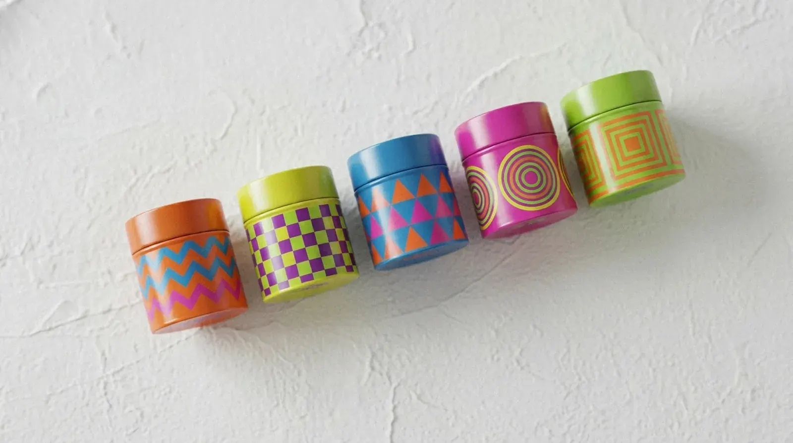
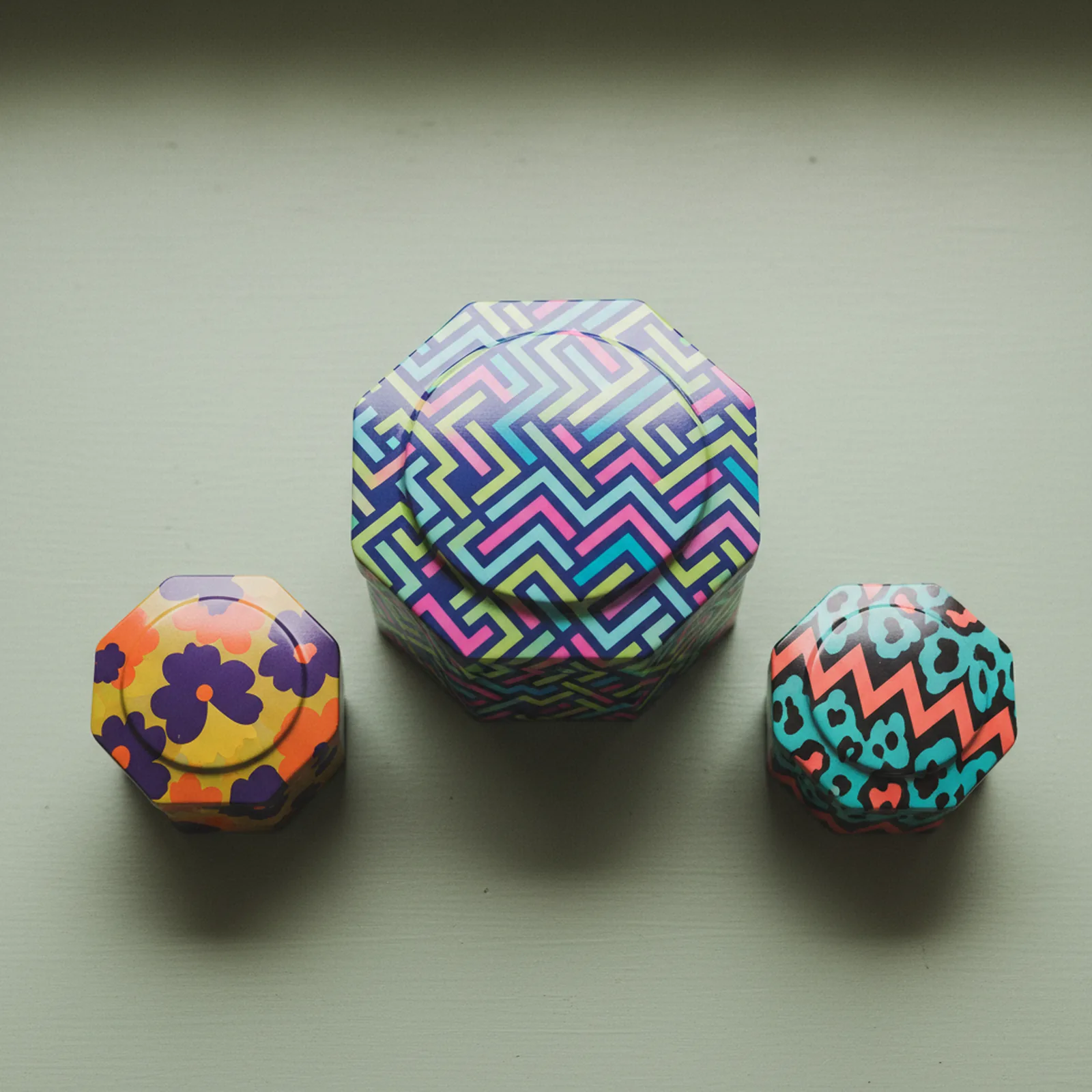
Minimalism has had a long run. Gen Z is the generation that's ending it. Dopaminergic packaging design answers the call for moments of pure, unadulterated joy with a riot of colors and patterns designed to trigger an instant mood boost — throwing conventional color theory out the window and opting instead for unexpected combinations that capture attention and lift spirits.
The industry term for what's happening in 2026 is "color maxxing." In the general consumer packaged goods (CPG) sector, 2026 is about using bold, full-color systems to stand out on crowded shelves — with high-contrast palettes, like what's being called "Neon Shock," particularly effective for creating attention-grabbing moments, especially for challenger brands and products aimed at Gen Z consumers who value individuality and shareable aesthetics.
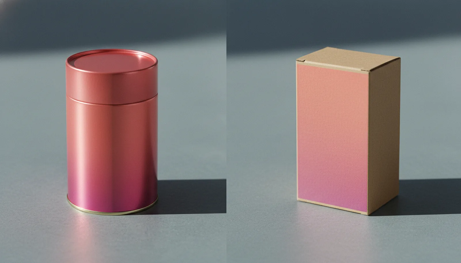
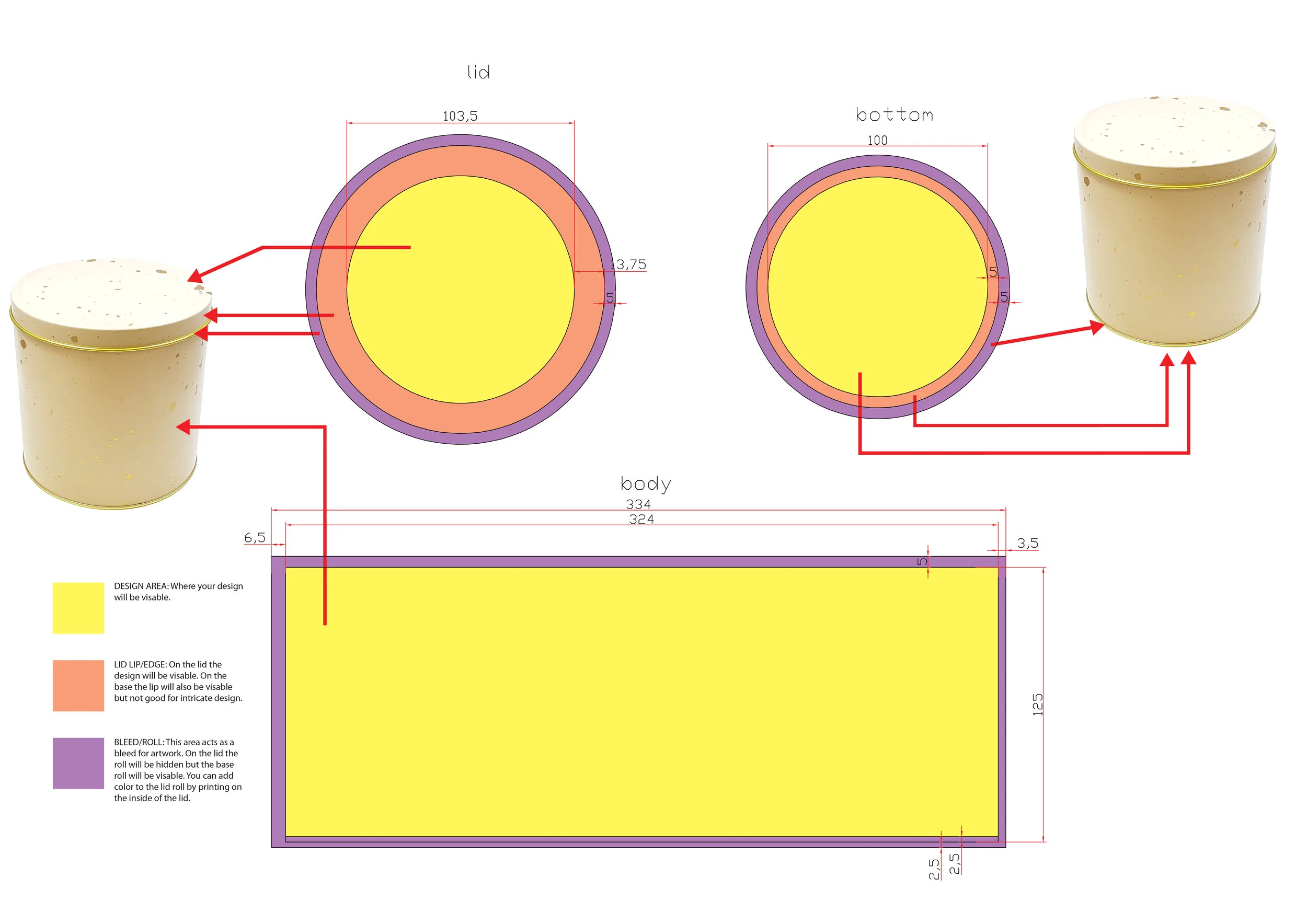
This is a significant creative shift — and it has real implications for material choice. Bold, clashing palettes only land if the substrate can hold them faithfully. Cardboard absorbs ink differently depending on its coating and weight. Tin, printed with full-surface CMYK offset lithography, renders saturated color with a consistency and vibrancy that cardboard rarely matches. A neon gradient that bleeds or muddles on paper sings on a well-printed tin. The reflective quality of metal also adds depth to color — a flat-printed orange reads differently on steel than on a matte-coated box. That isn't a minor detail. It's the difference between packaging that photographs well and packaging that doesn't.
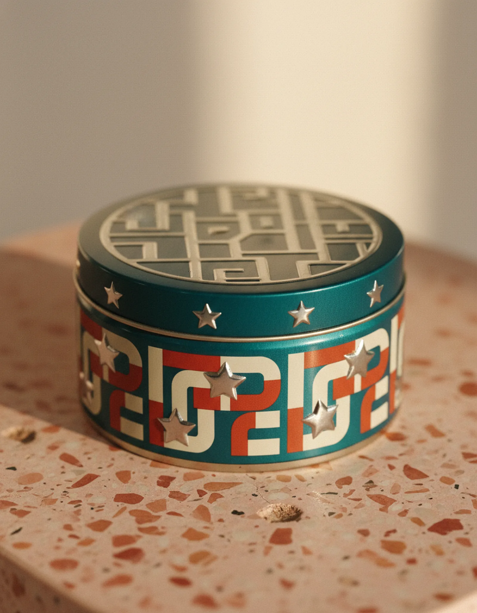
2. Retro-Futurism: 70s Type Meets Digital Energy
Retro-futurism — a trend that fuses nostalgia with innovation — is one of the dominant aesthetics of the moment: picture 70s typography, 90s pixel art, or Y2K metallics paired with modern layouts and digital-inspired finishes. Gen Z, who grew up loving vintage aesthetics on TikTok and Instagram, finds comfort in nostalgia but also craves innovation, so this "old-meets-new" aesthetic offers both.
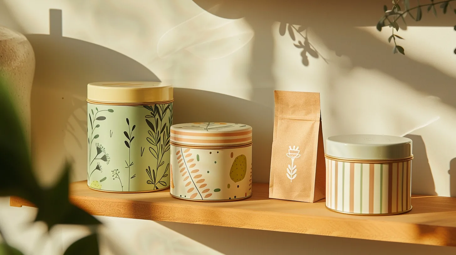
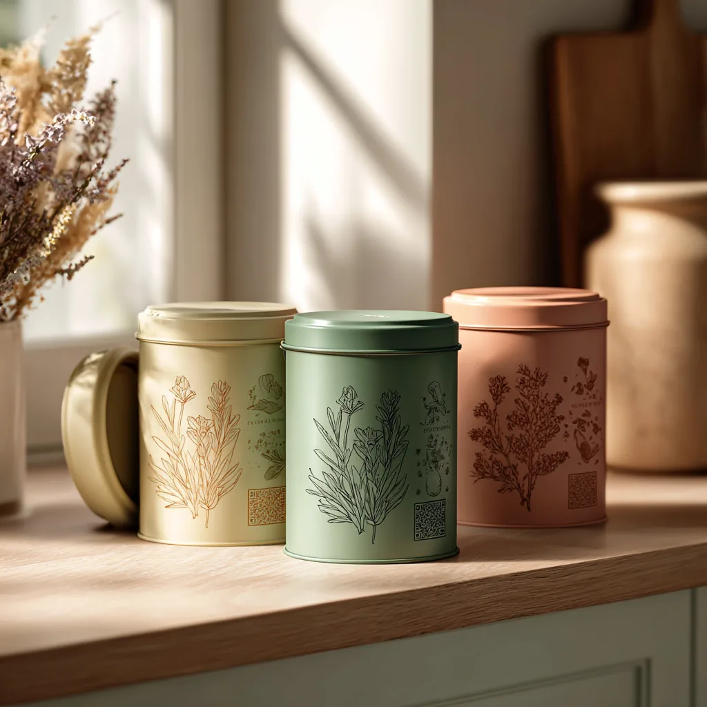
For tin packaging, retro-futurism is almost a natural fit. Tins already carry an inherent vintage credibility — the category has a long cultural history in everything from biscuit tins to tea caddies — and when you layer a bold, modern graphic sensibility on top of that physical weight and permanence, you get something that genuinely feels like the future and the past at the same time.
Embossing and debossing add another dimension here. A raised serif type treatment, embossed 1mm deep into the lid of a tin, gives typography a tactile quality no printed cardboard box can replicate. A unique tactile experience feels highly valuable and memorable, significantly enhancing the unboxing and product-use ritual. Retro-futurism is explicitly a sensory aesthetic — it's about feel as much as look — and metal delivers on both.
3. Cultural Provenance Storytelling
Gen Z celebrates diversity, heritage, and global creativity, and in 2026 there's a surge of culture-inspired packaging that borrows from local art forms, traditional patterns, and regional languages — from hand-drawn Indian motifs to Afro-futuristic textures and Latin colour palettes, storytelling through design where every pack becomes a cultural postcard.
This trend asks more of a printing process than most. Cultural provenance storytelling relies on fine-line detail, rich color field accuracy, and the ability to render handcrafted or illustrative elements at print quality without losing texture or nuance. Stannum Can's offset lithography handles exactly this — Pantone spot color matching allows for the kind of color fidelity that cultural motifs demand, where "close enough" isn't close enough. A traditional pattern printed two shades off its reference loses meaning. Printed to specification, it earns trust.
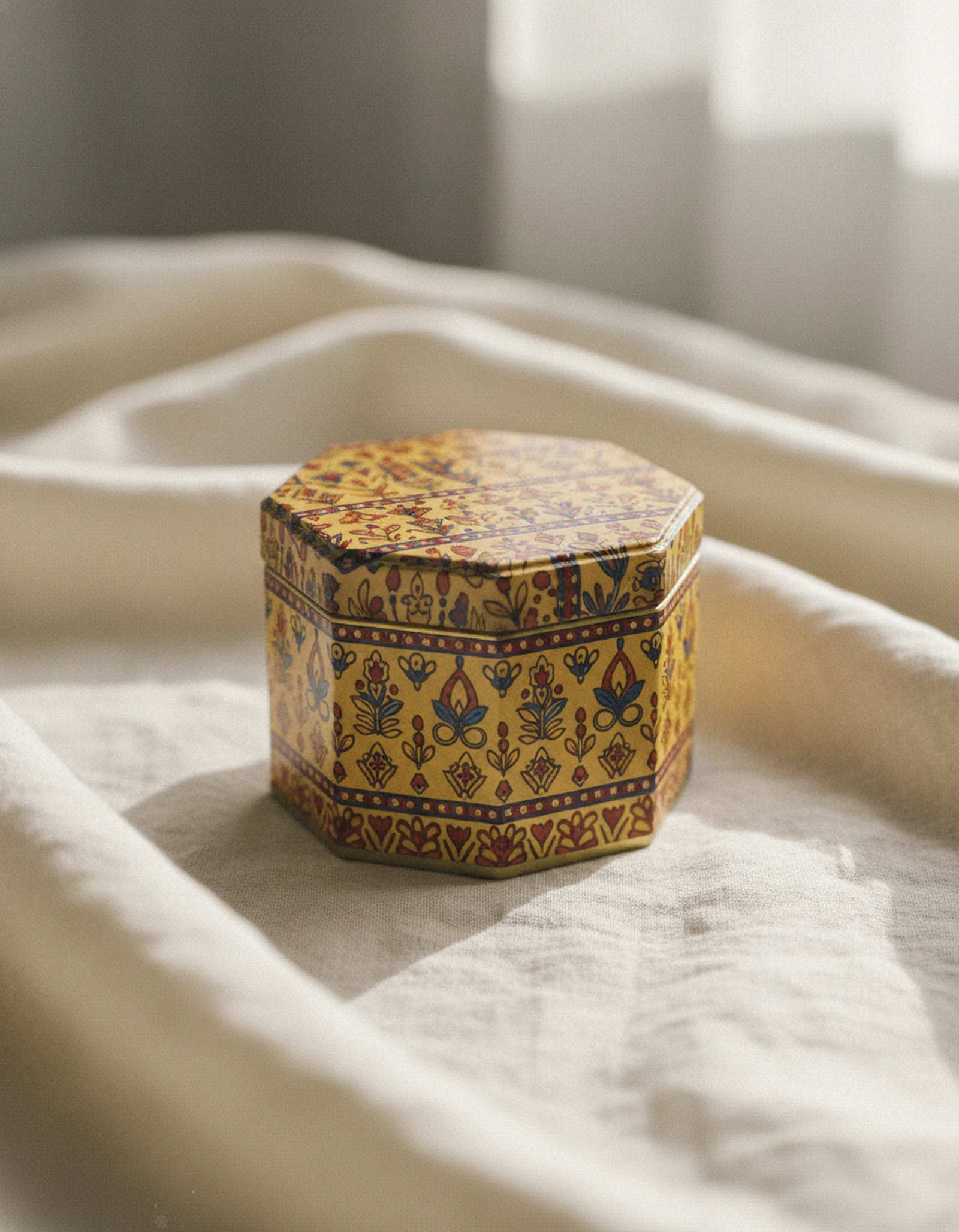
There's also a shape consideration here. Cultural storytelling benefits from surface area. A round two-piece tin with a full-bleed wraparound print gives an illustrative design room to breathe and tell a story in a way that a small rectangular box doesn't. Specialty shape tins — lanterns, octagons, pillow tins — carry cultural associations of their own, and pairing an appropriate structural form with a heritage-led graphic system creates a level of intentionality that Gen Z reads clearly.
4. Radical Transparency
Gen Z is the first truly "climate-conscious" consumer generation, possessing deep-seated skepticism toward corporate claims and demanding radical transparency regarding environmental impact — moving beyond basic ingredient lists to feature clear, honest labeling about sourcing, manufacturing, carbon footprint, and disposal instructions.
For tin, this is an area of genuine structural advantage, not just messaging. Tin is infinitely recyclable without quality loss. Steel packaging achieves recycling rates of 85%+ across the EU (APEAL) — and tinplate has held over 90% in Germany for nearly two decades, per gvm (Gesellschaft für Verpackungsmarktforschung). Those aren't marketing claims; they're independently tracked metrics. For brands selling to consumers who actively fact-check sustainability claims before converting, that kind of verifiable data is exactly what earns the benefit of the doubt. Pairing it with QR-accessible content — supply chain details, factory certifications, material origin — takes the story further. We've written about exactly this kind of smart tin integration in our earlier piece on QR codes and NFC in tin packaging.
Where Tin Shape Becomes the Strategy
Trend execution isn't only about print. Gen Z loves packaging that is fun to hold, snap, and share on social — with playful geometry, modular stacking, and ergonomic shapes that feel unexpected. Boxes don't do this well. Tins can — because the shape itself is part of the design.
With over 5,000 existing molds across our factory, there's meaningful room to match shape to brand identity without the cost and lead time of fully custom tooling. A cosmetics brand leaning into dopaminergic color might pair with a hexagonal tin. A food brand storytelling around cultural heritage might select a lantern-shaped structure. A collectible product targeting Gen Z fandom communities — a meaningful segment of whom are drawn to formats that connect with fandoms, rituals, or niche communities — might use a novelty shape that references the product universe directly.
When packaging is photogenic, the compositional hook of an unusual shape compounds the effect. A round tin photographs differently than a square one. An embossed lid catches light. An unusual polygon structure becomes its own subject. The brand's distribution footprint grows every time someone posts.
What This Means for a Packaging Brief
Gen Z design isn't actually that complicated to brief for — what it demands is specificity and commitment. Designs that try to hedge (a little bold, but not too much; a little cultural, but safely generic) tend to land in the gap between conventional and expressive, satisfying neither audience. The aesthetic asks for a point of view, and tin rewards brands that have one.
A few things we see often enough that they're worth calling out. First, color ambition is meaningless without color accuracy — if you're briefing a neon palette, come prepared with Pantone references, not just mood board screenshots. Second, if cultural motifs are part of your design, they need to be authentic to the community they reference — Gen Z's ability to identify tokenism is sharp, and the community being referenced usually speaks louder than the brand. Third, shape isn't decorative — the structural form of the tin is part of the design system, and selecting it early (rather than defaulting to a rectangle and then designing the graphic) produces better work.
Samples from existing molds are available in 10 to 14 days, which means the exploration phase for shape selection doesn't have to be theoretical. Production on a standard project runs 30 to 60 days depending on finish and complexity, with new-mold tooling adding 4 to 6 weeks if the brief calls for something outside the existing library.
A Note on Collectibility
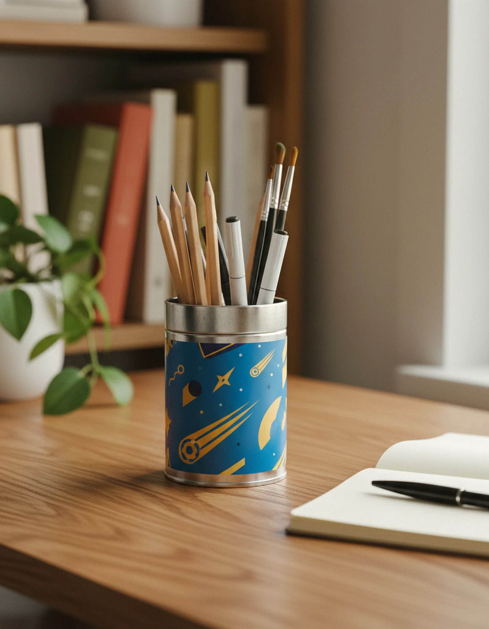
One of the more durable Gen Z packaging behaviors is the reuse impulse — the instinct to keep the tin rather than discard it. Limited-edition metal packaging can act as a storytelling medium, transforming products into keepsakes. For food brands, gifting companies, and cosmetics brands alike, designing with "second life" in mind — thinking about what a consumer might use the tin for after the product is gone — shifts the packaging from a cost to a conversation. A tin that becomes a desk organizer, a seed-starting pot, or a display piece on a bookshelf continues to carry the brand long after the product is consumed. That's a kind of media value that doesn't show up in any media buy.
This also connects to sustainability in a way that resonates with Gen Z without requiring a lecture. A tin someone keeps isn't a tin that goes to recycling. The story tells itself.
If you're rethinking how your packaging speaks to a younger audience — or simply trying to design something that earns attention in a crowded feed — we'd be glad to look at the brief with you. Explore our work gallery for examples of how brands across food, gifting, and cosmetics have used tin shapes and print finishes to build something visually distinctive. Or get in touch to start a conversation about what your project needs.
Related reading: Smart Tin Packaging: How QR Codes and NFC Turn Metal Into a Digital Experience · How Tin Packaging Helps Brands Stay Ahead of EPR and Recyclability Regulations · 7 Custom Decorative Tin Designs to Elevate Your Brand