
If you've ever tried to design artwork for a tin and ended up with a printed result that didn't quite match what you saw on screen, the tin packaging die-line was probably doing you a favor you didn't know to ask for. Die-lines are the bridge between a designer's file and what actually comes off the production line — and once you understand how to read one, preparing print-ready artwork for custom tin packaging becomes a lot less guesswork.
This guide walks through exactly what each zone of a Stannum Can die-line means, how the curvature of a tin affects your design choices, and the print techniques that make a tin look like the mockup instead of a compromise of it.
What a Tin Packaging Die-line Actually Is
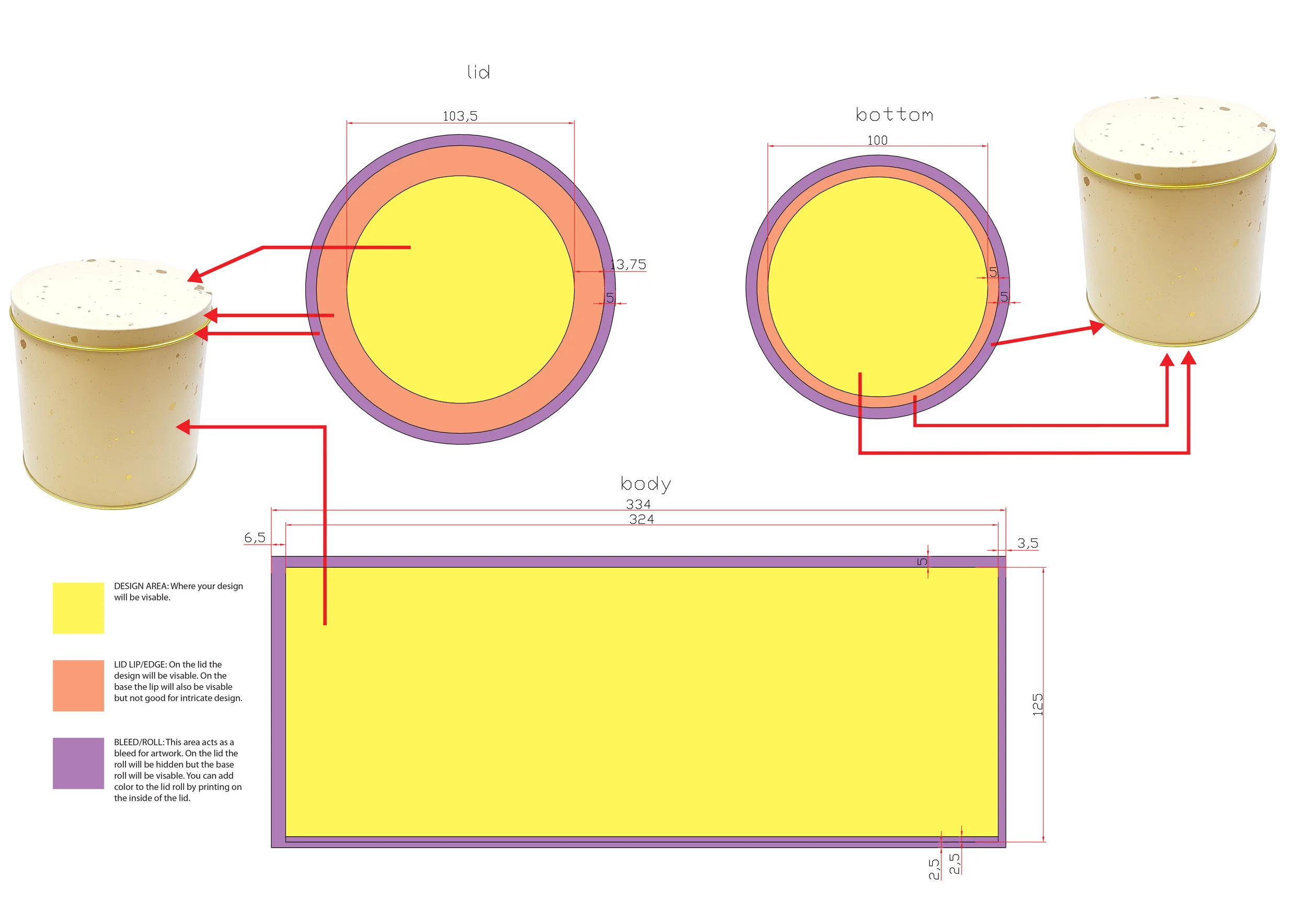
A die-line is a flat, scaled template that shows every surface of a tin as if it had been unrolled onto a single plane. For flat packaging like a folding carton, die-lines are relatively simple — they mostly show cut lines and fold lines. For tin packaging, they have to show something more complicated: the transition between flat surfaces and curved ones, and the difference between areas that will be visible, areas that roll out of sight, and areas that behave like a bleed zone.
At Stannum Can, every custom tin design project starts with a die-line specific to the shape and size you're producing. Whether it's a round candle tin, a rectangular gift tin, a slide-top cosmetic tin, or a novelty shape, the die-line is generated to match that specific tooling. The measurements on it aren't estimates — they're the literal dimensions the factory will be printing and cutting to.
The Three Zones, and What Each One Does
Our die-lines use a consistent color code so designers can see at a glance which part of the artwork is doing which job.
Yellow — the Design Area
This is the visible surface. Anything you place inside the yellow zone will appear on the finished tin, right-side up, in the spot you intended. This is where your logo, illustration, product information, and any primary visual language should live.
One thing worth noting: the yellow area is where your design needs to work compositionally — meaning any key visual elements (a face, a word, a focal point) should have breathing room from the edges of the zone. Edges are where tolerances show up, and a logo pushed right up against the boundary of the yellow area runs the risk of sitting awkwardly close to the lid edge on the finished tin.
Orange — the Lid Lip / Edge
On a tin lid, the orange zone is the narrow vertical edge that wraps around the top. It is visible on the finished product, but it's also curved and relatively narrow — which makes it a bad place for intricate detail, small type, or anything that needs to read precisely.
On the base of the tin, the orange lip behaves differently depending on the shape, but the general principle holds: the lip is visible real estate, but it's constrained. Treat it as a secondary surface. Solid colors, simple patterns, and continuous background elements work well here. Fine detail usually doesn't.
Purple — the Bleed / Roll
The purple area is where your artwork should extend past the visible surface — the same way you'd set bleed on a printed book cover or a business card. On the lid, the roll wraps underneath and is hidden from view once the tin is assembled. On the base, the purple roll is typically visible along the bottom edge, so it functions more like a continuation of the design than a true bleed.
There's a useful technique here that not every designer knows: because the lid's inside surface can be printed too, you can add color to the underside of the lid roll by printing on the inside. This is how brands create those premium "surprise" moments where opening a tin reveals a second color or pattern inside. It's a small touch, but it's one of the details that separates a basic tin from a custom decorative tin that feels considered.
Reading the Measurements and Guides
Every Stannum Can die-line displays the width of each design area, lip, and roll in millimeters. These measurements aren't decorative — they correspond directly to the physical tooling. If the yellow area is 72mm wide, your design needs to be built to that width, and any scaling you do in your design software needs to preserve those dimensions.
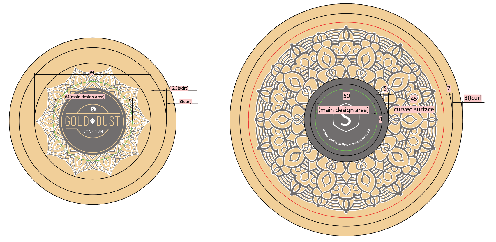
Alongside the color zones, you'll see guides marking the points where the flat surface of the tin begins to roll or curve. These are especially important for designs with horizontal bands, text, or rigid geometric elements. A pattern that looks centered on a flat die-line can appear off-center on the finished tin if the design doesn't account for where the curve begins.
A good habit: any element you want to appear on the "face" of the tin should sit comfortably within the flat portion of the yellow zone, with the roll guides treated as soft boundaries rather than hard ones. This interplay between surface geometry and design intent is one of the reasons how a tin is constructed shapes every design decision.
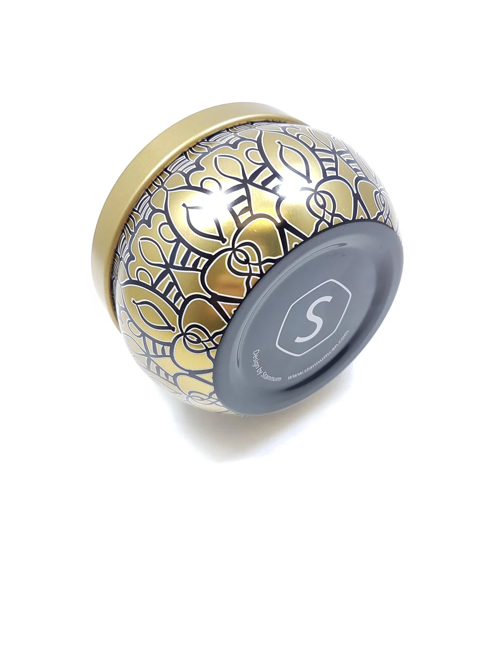
Printing with Raw Tin Showing Through
One of the most distinctive looks in custom tin packaging is letting the raw metal of the tinplate itself become part of the design — either as a background, an accent, or a highlight with that unmistakable metallic shine no printed gold can fully replicate.
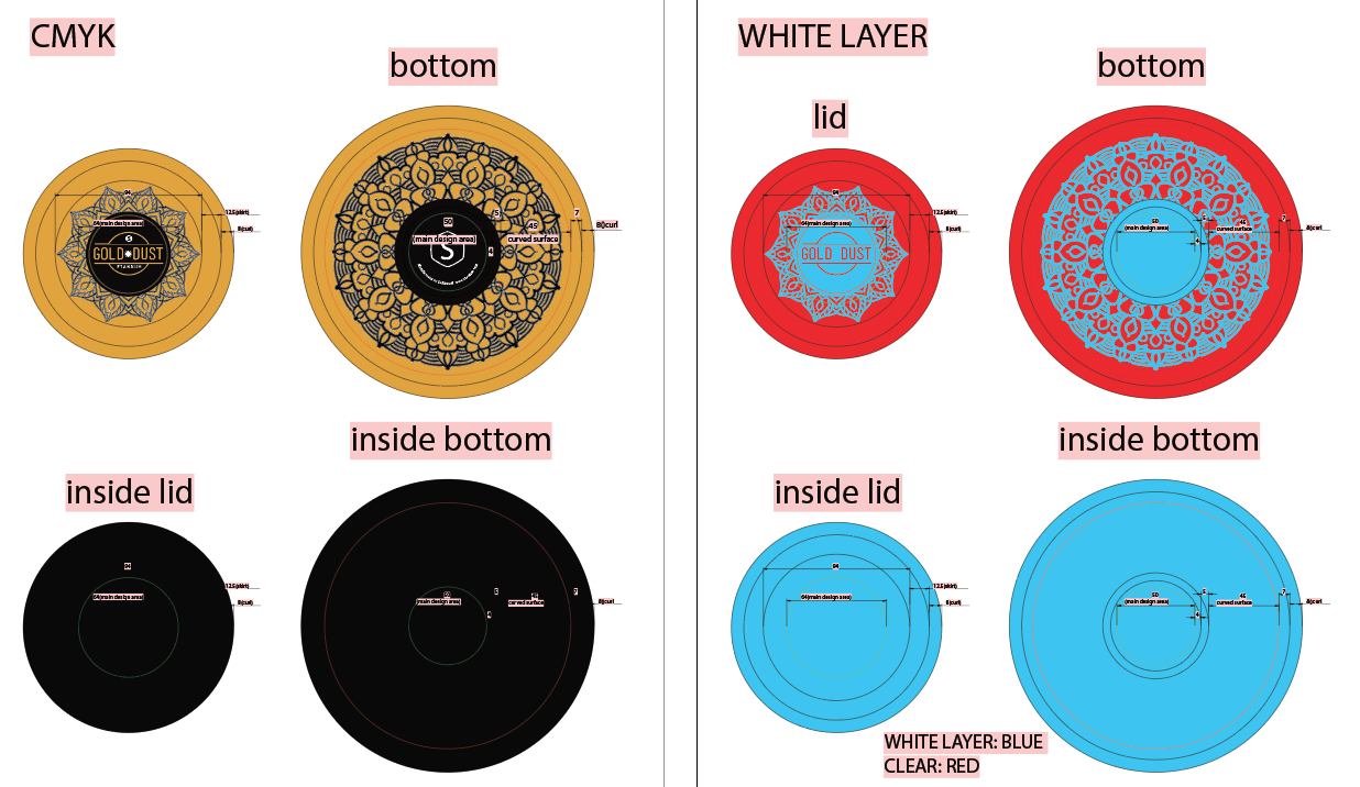
To make this happen, the factory needs a white print layer in the artwork file. Here's why: tin packaging is typically printed using offset lithography, and most printed colors are semi-transparent on their own. When you print a red or a blue or a black directly onto bare tinplate, the metal shines through and shifts the color. For a flat, accurate color, printers lay down a white base first, then print the CMYK or Pantone colors on top.
The white layer is essentially a mask. Where you want printed color to appear as intended, the white layer is present underneath. Where you want raw tin to show through, you leave the white layer out entirely. The factory uses this white layer as a map for where to lay down the base coat.
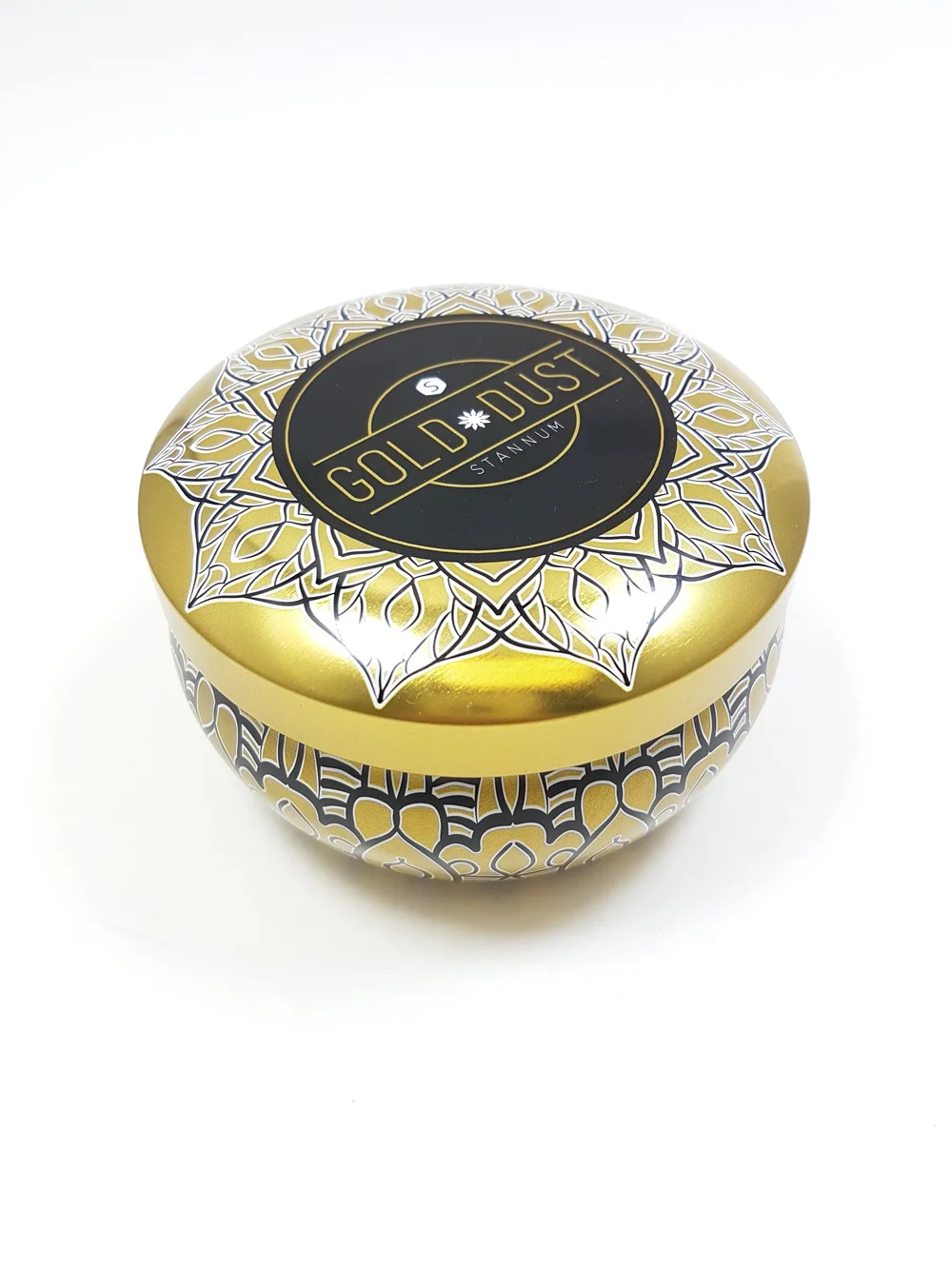
A finished design using this technique might have:
- A white-backed area carrying a CMYK illustration
- Pantone spot colors for brand-critical elements like a logo
- Negative-space areas where the tin itself becomes the "color"
The finished example below uses exactly this approach — a white underprint was built into the file to support the gold and black artwork, with the bare tin showing through in selected areas to create a contrast no printed finish could achieve.
CMYK, Pantone, and When to Use Each
A quick note on color, because it comes up on almost every project.
CMYK is the standard four-color process used for photographic or illustrated artwork. It's how printers reproduce a wide gamut of colors using cyan, magenta, yellow, and black inks. CMYK is the right choice for detailed imagery, gradients, photography, and anything with lots of color variation.
Pantone (spot colors) are pre-mixed inks matched to a specific shade. They're used for brand colors that need to be exact every time — the precise red of a recognizable logo, for instance — and for special finishes like metallics and fluorescents that CMYK can't reproduce accurately.
Most custom tin packaging projects use a combination of both: CMYK for the main artwork, Pantone for logos and brand-critical elements, and sometimes a dedicated white plate for areas where raw tin shows through. If you're not sure which your project needs, a good rule of thumb is that anything defining your brand identity belongs in Pantone, and anything decorative or illustrative can usually live in CMYK.
Common Mistakes to Avoid
A few things we see often enough that they're worth calling out in advance:
- Ignoring the lip. Designers sometimes treat the orange zone as an extension of the main design and end up with type or fine detail on the curved lid edge, where it won't read clearly. Keep the lip simple.
- Forgetting bleed on the base roll. Because the base roll is visible, a design that stops exactly at the edge of the yellow area will leave a hairline of raw tin showing at the bottom of the finished tin. Extend background colors and patterns into the purple zone.
- Submitting RGB files. Screen-based color modes don't translate cleanly to print. Convert everything to CMYK (and specify Pantones separately) before sending final files.
- Missing the white layer. If raw tin showing through is part of the design, the white layer has to be present as its own distinct element in the file. Without it, the factory has to guess where the base coat should go — and guesses in manufacturing rarely end well.
- Designing at the wrong scale. Always build artwork at the exact dimensions shown on the die-line. Scaling up or down after the fact can soften vector edges, shift alignment, and pull key elements out of the flat printing zone.
A Pre-submission Checklist
Before sending artwork to production, run through this:
- Artwork is built at the exact dimensions of the die-line
- All key elements sit inside the yellow design area, away from curve guides
- Background colors and patterns extend through the purple bleed zone
- A white layer is included if any area is meant to show raw tin
- Color mode is CMYK, with Pantones called out separately
- Fonts are outlined or embedded
- File is supplied as a vector format (.ai, .pdf, or .eps) where possible
- Lip treatment is simple enough to read clearly on a curved surface
If You're Not Sure, Ask
Die-lines can look intimidating the first time you open one, especially on a complex tin shape. If you're working on a project and you're not sure whether a particular element will translate correctly — whether a logo is too close to the roll, whether a pattern will continue cleanly around the curve, whether the white layer is set up the way the factory expects — the answer is always to ask before the file goes into production.
A five-minute conversation before printing is considerably cheaper than a reprint after it. Our team reviews artwork against the die-line on every project, and we'd rather flag a concern at the file stage than send you finished tins with a fixable issue baked in.
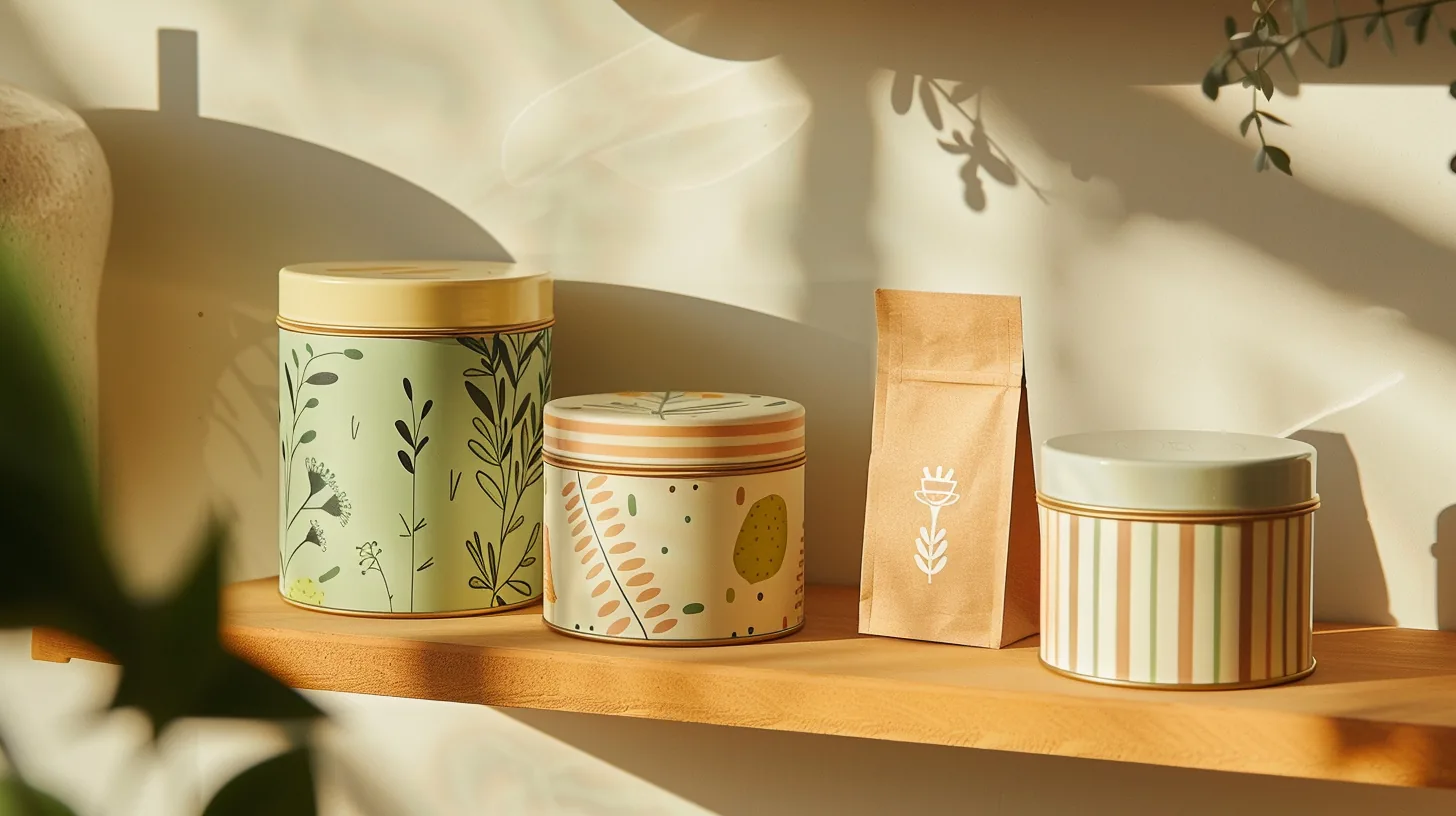
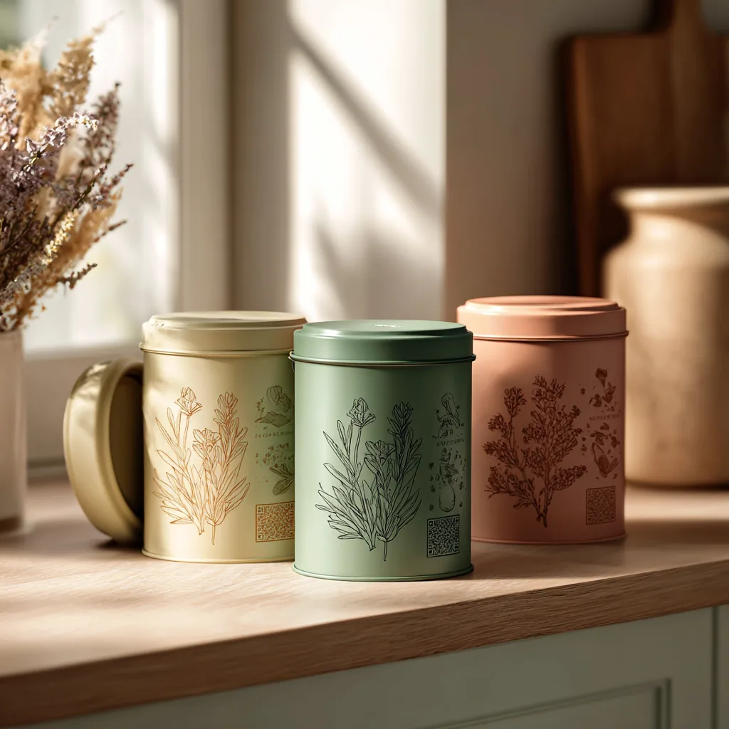
Stannum Can manufactures custom decorative tin packaging for food, cosmetics, gifts, candles, and collectibles. We provide die-lines, artwork review, and print expertise as part of every project. Browse our tin gallery for shape references, or get in touch to request a die-line for a shape you're considering.