If you've ever watched an older relative struggle with a jar lid, or fumbled with a vacuum-sealed pouch yourself while your hands were full, you already understand the problem that accessible packaging is trying to solve. For a long time, "accessibility" in packaging meant a Braille label on a medicine box and not much else — a compliance checkbox handled at the very end of the process. That's changing fast. In 2026, accessibility has moved from a niche accommodation to one of the most active conversations in packaging design, and it's being driven by two forces at once: regulation and demographics.
The interesting part, from where we sit on the factory floor, is that tin is unusually well suited to this shift. A lot of the features that make packaging more accessible — raised tactile markings, surfaces you can identify by touch, lids engineered to open with one hand — are things metal does naturally, and things we've been building into custom tins for other reasons all along. Embossing was a decorative technique long before anyone called it a wayfinding cue. What's new is the realization that the same capability can do double duty.
What "accessible packaging" actually means
Accessible packaging — also called inclusive or universal design packaging — is built so that the same package works for as many people as possible without a separate "special" version. The principle is that one well-designed package should be easy to open, hold, read, and use whether the person reaching for it has perfect vision and full dexterity or not.
In practice, the field tends to cluster around a handful of features. There's user-friendly opening, often one-handed and tool-free. There are tactile and Braille elements — raised symbols or markings that let someone identify a product, or orient it, by touch. There's ergonomic design: grips, contoured shapes, and closures that minimize strain. And there's legible communication: high-contrast text and clear iconography that doesn't demand 20/20 vision to parse. Industry commentary in 2026 increasingly frames these not as add-ons but as a baseline design standard, with award programs like the Dieline Awards and Pentawards spotlighting inclusive work. Packaging trend analysts have started describing accessibility as a design default rather than a side note.
The key shift in thinking is this: disability isn't a narrow category. Temporary injuries, the natural changes of aging, and ordinary situational limits — cold hands, a baby on one hip, reading a label in dim light — mean that design built for the edges ends up serving the middle, too. That's the whole premise of universal design.
Two forces pushing this up the agenda
The European Accessibility Act
The regulatory pressure has a name and a date. The European Accessibility Act — Directive (EU) 2019/882 — began applying across the EU on 28 June 2025, harmonizing accessibility requirements that had previously varied country by country. It's worth being precise about its scope, because it's easy to overstate. The EAA's product requirements center on a defined list — things like consumer banking terminals, e-readers, smartphones, and self-service kiosks — rather than every consumer good on the shelf. But for the products it does cover, the law is explicit that accessibility requirements extend to packaging, instructions, and labelling — not just the device itself.
So the EAA isn't a blanket mandate that every cookie tin carry Braille. What it has done is set a direction of travel and raise the bar for what "good" looks like — and that expectation tends to spread well beyond the legally in-scope categories. Regulation rarely stays contained to its original list; it reshapes what buyers and brand managers consider table stakes.
A market that's aging and enormous
The demographic force is, if anything, the stronger one. The World Health Organization estimates that 1.3 billion people — about 16% of the global population, or one in six of us — live with a significant disability today, a number that's rising as populations age and chronic conditions become more common. The World Economic Forum has put the spending power of this group, together with their friends and family, at around $13 trillion.
Aging compounds it. According to UN figures, the number of people aged 60 and over is projected to grow 56% between 2015 and 2030 — from 901 million to 1.4 billion — and to reach nearly 2.1 billion by 2050, with more than 46% of older people already living with some form of disability. This is the cohort sometimes called the "silver economy," and it holds a disproportionate share of discretionary spending in most developed markets. These are not consumers a premium brand can afford to design around. A package that causes "wrap rage" or physical discomfort is, for this audience, a reason to switch brands.
Put the two forces together and the conclusion is hard to argue with: accessible design has stopped being a moral nicety and become a commercial one.
Why tin is structurally suited to this
Here's where the material matters. A lot of accessibility features are genuinely hard to execute well in flexible or fibre-based packaging, but they map cleanly onto what tin already does.
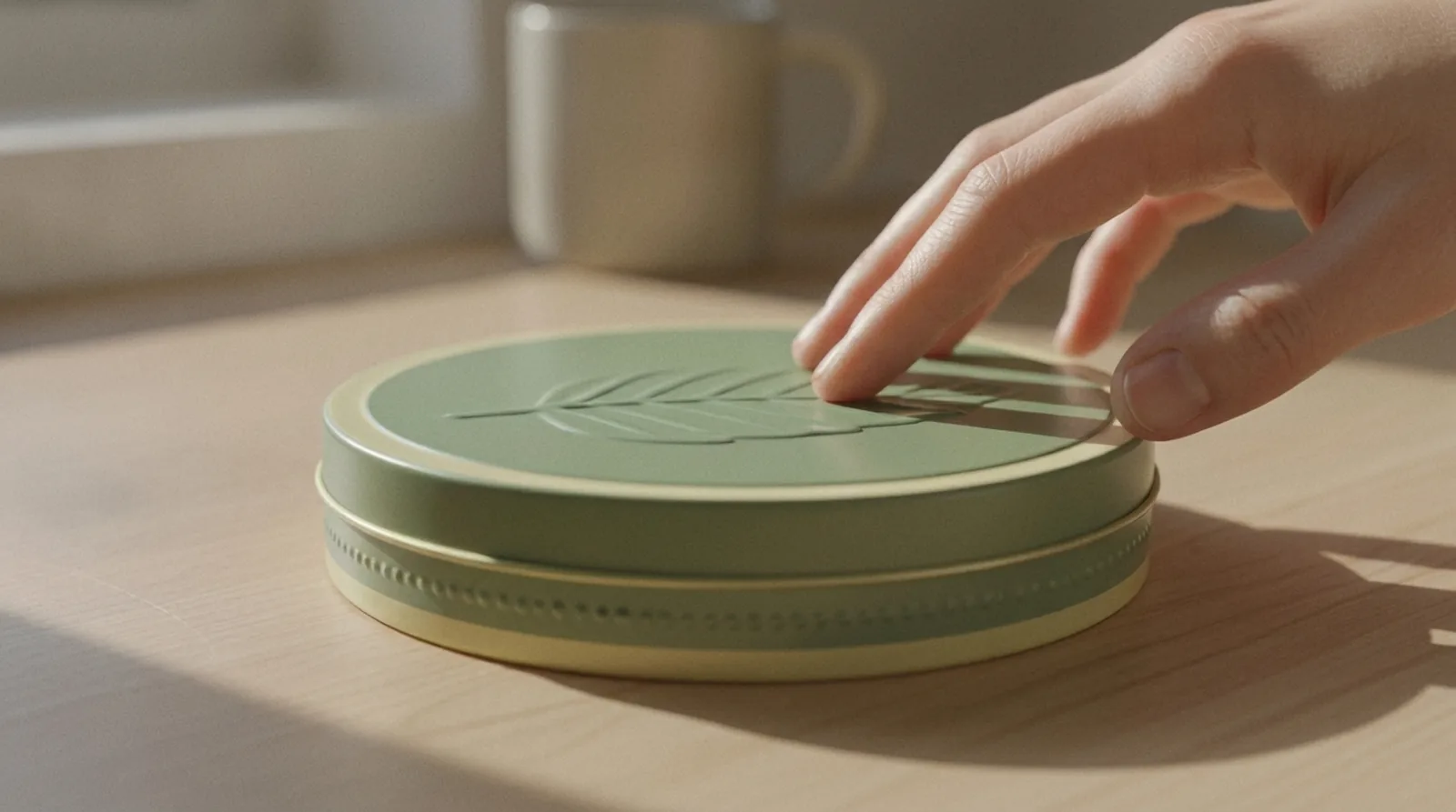
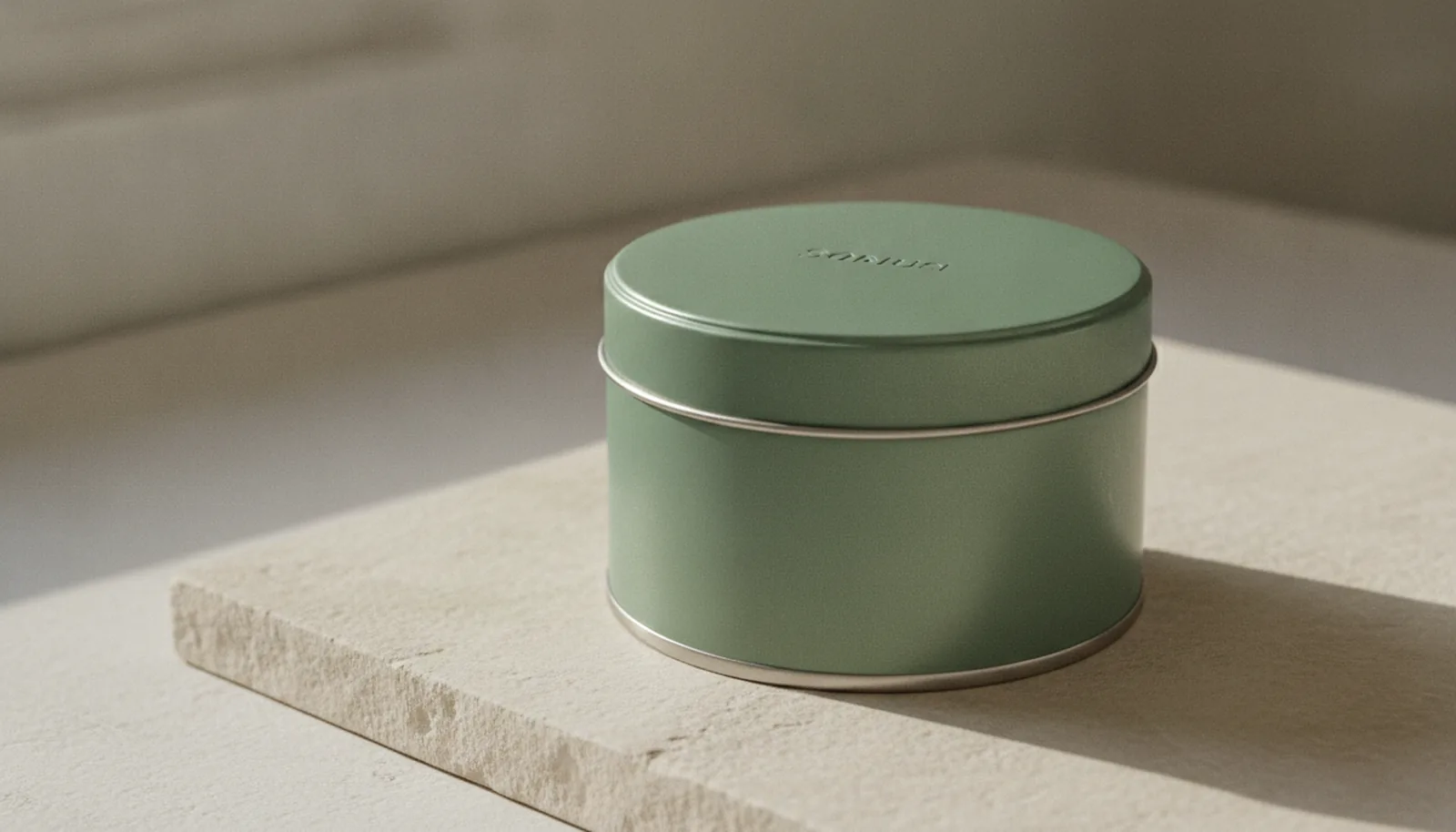
Embossing is a tactile cue you've already paid for. Embossing and debossing — raising or recessing part of the surface — are core to custom decorative tins, and on metal they hold crisp, durable definition down to roughly 1mm. We usually talk about embossing as a premium finish, the thing that separates a basic tin from one that feels considered. But a raised logo or pattern is also a wayfinding feature: it tells a hand where the top is, which way is up, and where to grip — all by feel, before the eyes are involved. People with low vision routinely use touch to orient an object and find its opening point, and most smooth packaging gives them nothing to work with. An embossed tin does. The same tooling that makes a tin look distinctive makes it navigable.
Metal holds raised markings that other materials smear. Tactile warnings and Braille have real, established standards behind them, and they were written with durability in mind. ISO 11683, the international standard for tactile danger warnings on packaging, specifies a raised equilateral triangle — 18mm to a side, or a reduced 9mm version where space is tight — and it applies regardless of package size. For medicinal packaging, the European standard EN 15823 governs how Braille is applied. The practical issue with any raised marking is that it has to survive handling, shipping, and shelf life without flattening or blurring. A rigid tinplate surface — embossed during forming, not glued on afterward — keeps that definition far better than a printed carton, where raised features depend on a coating or an applied label that can crush or peel. If a tactile feature is going to mean anything, it has to still be there when the customer's finger arrives. Metal is good at that.
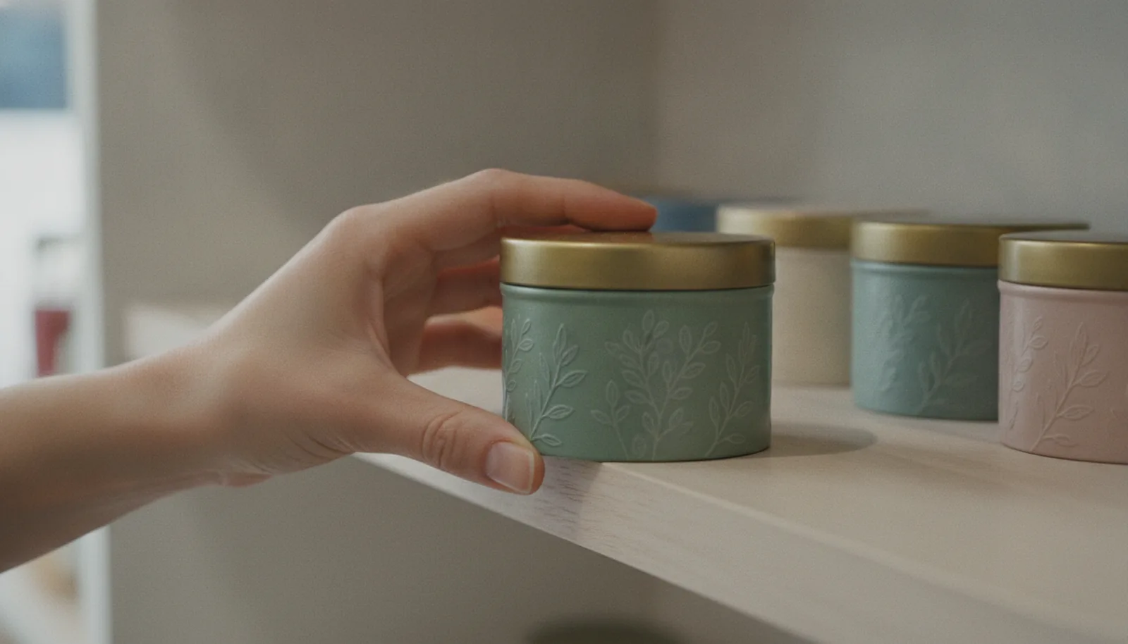
Rigid structure makes ergonomic opening engineerable. Because a tin holds its shape, opening mechanics become a design decision rather than a hope. A hinged lid can be tuned so the gap, the lip depth, and the spring of the hinge let it open with a single thumb — no second hand pinning the base, no fingernail prying at a seam. A recessed grip can be formed into the body so there's an obvious, comfortable place to hold. These are the kinds of details that matter enormously to someone with arthritis or limited grip strength and go completely unnoticed by everyone else, which is exactly the point of universal design.
Designing a one-handed, low-strain open
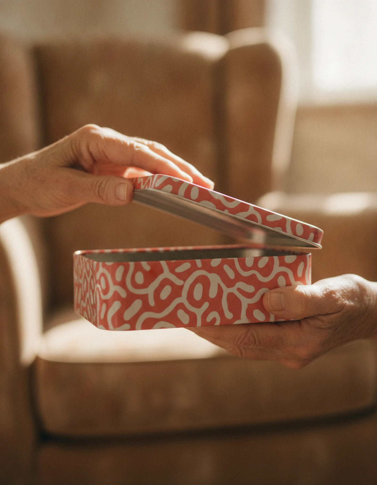
One-handed opening is the feature people feel most immediately, so it's worth unpacking what actually goes into it. A hinged-lid tin that opens easily isn't an accident — it comes from a few deliberate choices at the mold and tooling stage. The lip needs enough purchase that a thumb can catch it without a nail. The hinge needs the right resistance: firm enough to stay shut in transit and on the shelf, loose enough that opening doesn't require a wrestling match. And the geometry has to let the lid clear its travel without the base needing to be held down.
None of this is exotic. It's the same structural design work that goes into any custom tin closure — it's just being pointed at a usability goal rather than purely an aesthetic one. The honest trade-off worth naming is that a very tight, satisfying "snap" closure and an effortless one-handed open pull in slightly different directions, so part of the job is finding the closure tension that serves both. That's a conversation we'd rather have at the design and prototyping stage than discover after tooling, because changing hinge behavior after the mold is cut is expensive and slow.
Beyond touch: contrast, legibility, and the whole experience
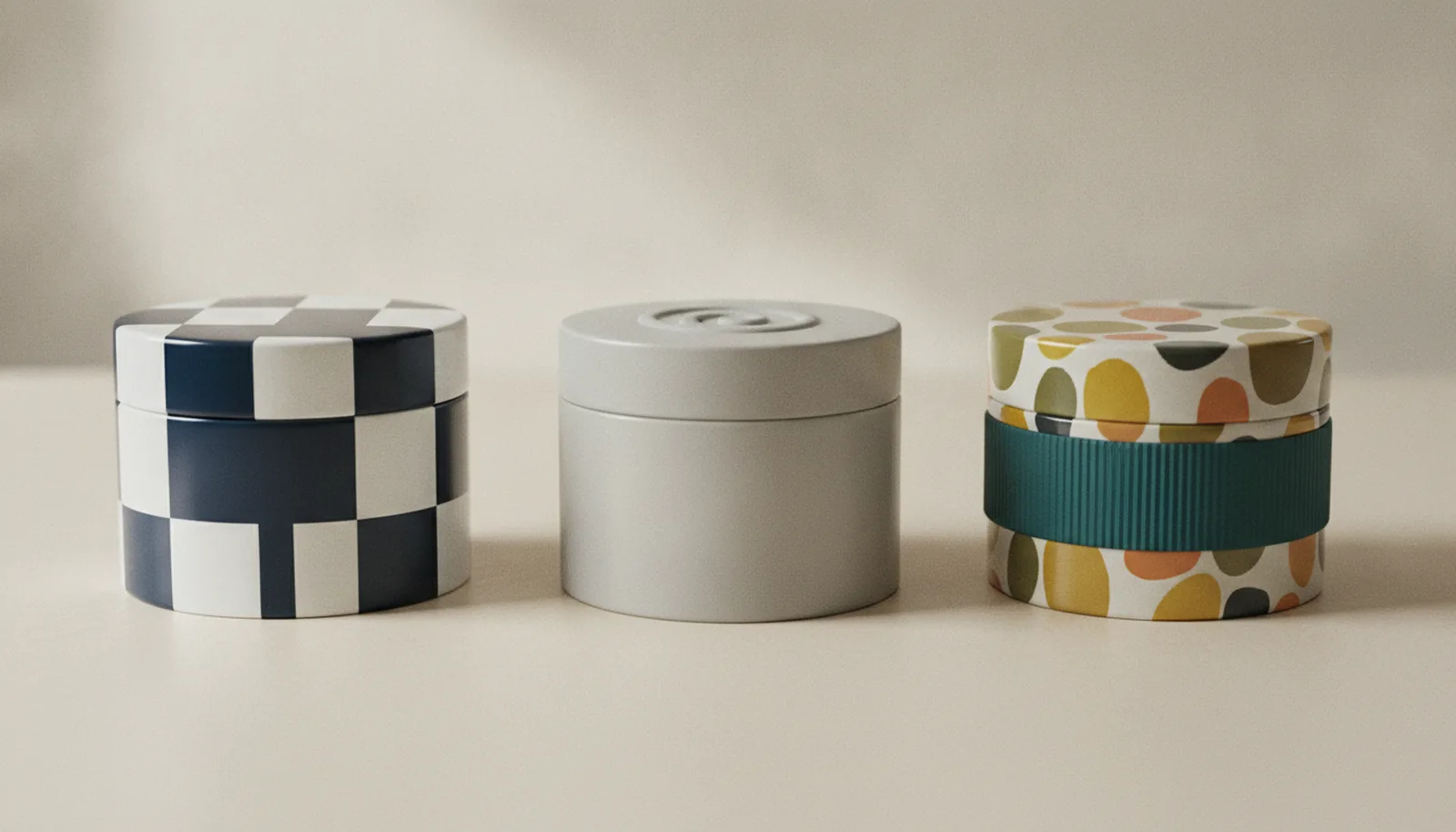
Tactile features get the attention, but inclusive design is bigger than what your fingers find. High-contrast colour and large, legible type do a lot of quiet work — and full-surface CMYK offset lithography with Pantone matching gives a brand precise control over exactly that. Strong figure-to-ground contrast between text and background, generous type sizing, and clean iconography make a label readable for someone with low vision and, not coincidentally, faster to scan for everyone else. The most thoughtful inclusive packaging being recognized right now tends to combine several of these layers — tactile, visual, and sometimes digital — rather than bolting on a single feature and calling it done.
This is also where smart features connect. A discreet QR code or NFC tag can route a user to audio instructions, large-print information, or a screen-reader-friendly page — extending the accessibility of a physical tin into the digital layer without cluttering the surface. We've written separately about how QR and NFC turn a metal surface into a digital touchpoint; accessibility is one of the most genuinely useful things that capability enables.
The framing that matters here is the one inclusive designers keep returning to: these features aren't compromises that make the package worse for the majority to serve a minority. A raised pattern is more engaging to hold. A one-handed lid is more pleasant for everyone. High-contrast type is easier for a tired commuter to read in a badly lit shop. Designing for the edges tends to improve the middle.
FAQ
Does the European Accessibility Act require accessible packaging for all consumer products?
No. The EAA's product requirements apply to a defined list — banking terminals, e-readers, smartphones, self-service kiosks, and similar — not every consumer good on the shelf. Where the EAA does apply, accessibility requirements explicitly extend to packaging, instructions, and labelling. The broader effect, though, is that the law has raised the bar for what "good" looks like across the industry, regardless of whether your specific product is technically in scope.
Why is tin better suited to tactile and accessible design than cardboard?
A few structural reasons. Embossing on metal is formed during the tin-making process itself, not glued or coated on afterward, so raised features hold crisp definition through handling, shipping, and shelf life. Cardboard cartons depend on layered coatings or applied labels for any raised marking — both can crush, peel, or flatten. Metal's rigidity also makes ergonomic opening mechanics — hinges, recessed grips, defined lips — engineerable rather than approximate.
Can a hinged-lid tin really be opened with one hand?
Yes, when it's designed for it. A one-handed open comes from deliberate choices at the tooling stage: enough lip purchase for a thumb to catch without a fingernail, hinge tension firm enough to stay shut in transit but loose enough to swing open easily, and geometry that lets the lid clear its travel without the base needing to be held down. None of that is exotic — it's standard custom-tin design pointed at usability rather than purely aesthetics.
Does embossing a tin for accessibility cost more than embossing it for decoration?
No — they're the same process. The tooling that creates an embossed logo for shelf appeal is also what creates a raised wayfinding marker for someone navigating by touch. That overlap is part of why tin works well here: the cost of the tactile feature is already absorbed in the decorative one, and a single design choice serves both.
Where this leaves a brand thinking about packaging
Accessible design is going to keep climbing the priority list — the regulation has set a floor, the demographics keep pushing the ceiling, and the award shows are making it visible. For brands, the encouraging part is that the move toward inclusivity doesn't have to mean a clinical, medicalized look. Done well, it's invisible: a tin that simply works better, holds its decoration with real surface depth, and opens without a fight.
That overlap between decorative intent and functional accessibility is what makes tin worth a serious look here. The embossing you'd commission for shelf appeal is also a tactile cue. The rigid body that protects the product is also what lets a hinge be engineered for one-handed use. The metal surface that takes a luxury finish is also what keeps a raised marking crisp through a year on the shelf. You're rarely choosing between beauty and accessibility — more often, the same decision serves both.
If you're weighing how to build inclusive features into a custom tin without losing the look you want, that's exactly the kind of trade-off our design team works through every day. Get in touch and we'll walk you through the options.