For about a decade, a lot of packaging started to look like the same packaging. Soft sans-serif type, a muted earth-tone palette, a tiny line-drawing of a leaf, maybe a single hero color and a wall of negative space. It was clean, it photographed well, and it was — by design — interchangeable. You could swap the logo on a hundred of those boxes and most shoppers wouldn't notice. Cultural storytelling — the kind that once made a package feel grounded in a specific place — had quietly been designed out. That flattening had a cause, and now it has a backlash.
The cause was partly aesthetic fashion and partly economics: minimal templates are cheap to produce, easy to extend across a range, and safe. The backlash is what's interesting. As generative tools have made it trivially easy to produce endless variations of competent, generic design, the value of design has quietly moved to the one thing those tools can't fake — a specific, grounded sense of place. After a decade of global minimalism that flattened brand identities into interchangeable sans-serif uniformity, consumers are gravitating toward packaging that feels rooted in a specific human place. Regional motifs, heritage patterns, local craft traditions, even local dialect on the label — these are doing the work that a clean wordmark used to do, and doing more of it.
This is one of the clearest design currents of 2026, and it has a name worth knowing: cultural provenance. The 2026 trend reviews coming out of the major awards bodies keep landing on the same point. In a world where AI generates endless templates, cultural provenance provides something algorithms can't — emotional specificity. It's a useful phrase because it's honest about the mechanism. The point isn't decoration for its own sake. The point is that a pattern carrying real cultural weight says something about who made the product and where, and that "where" has become a competitive advantage.
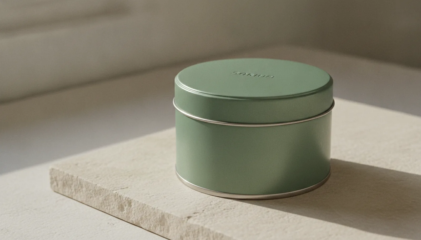
For anyone choosing a packaging format, this matters more than it might first appear — because not every material carries cultural artwork equally well. Tin happens to be one of the formats that carries it best, and it has been doing so for a very long time.
Tin has always carried culture
Here's the part that often gets missed in the trend write-ups: this isn't a new job for tin. Decorative metal packaging has been a vehicle for regional identity for well over a century, and some of the most enduring examples in the world are tins.
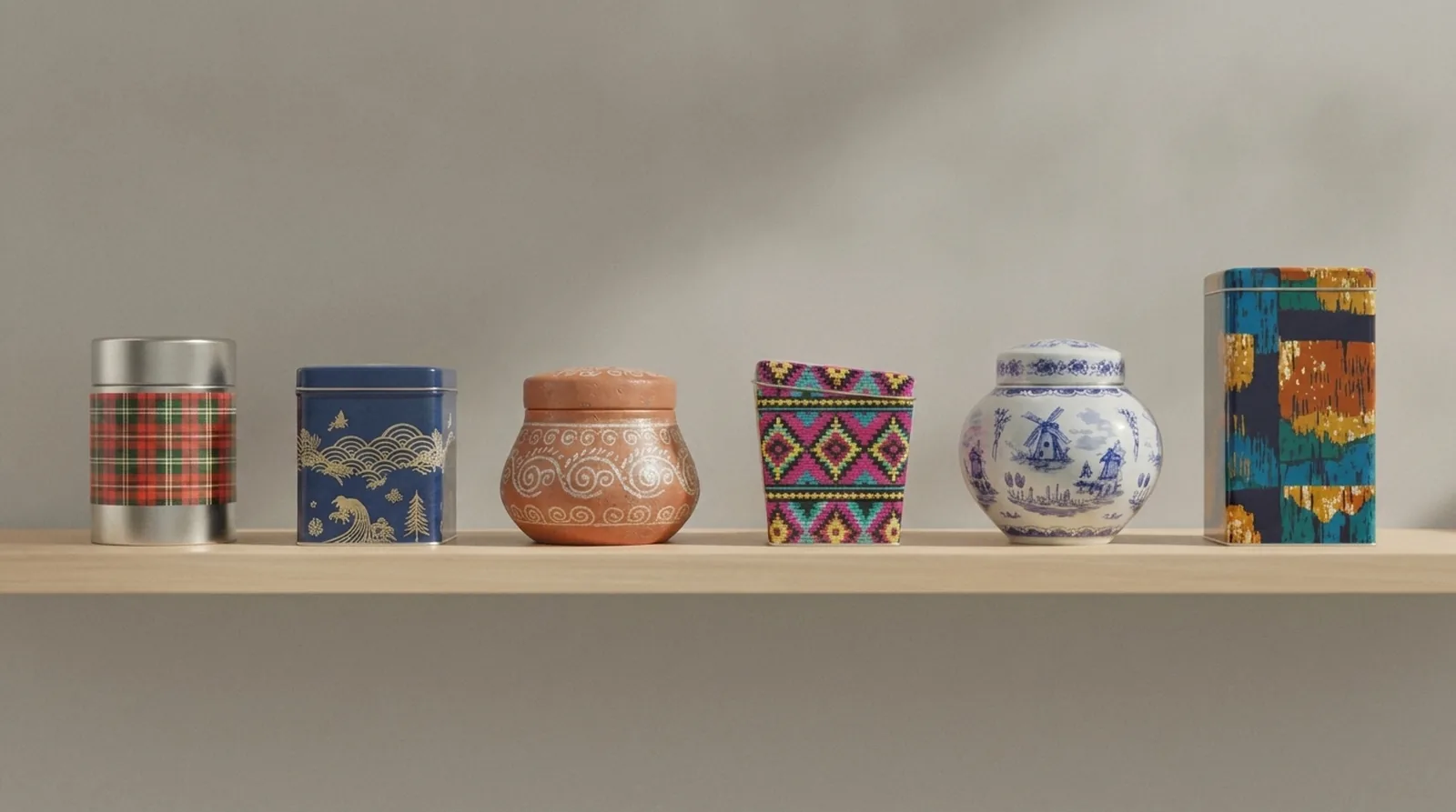
Walk through the evidence. Scottish shortbread arrives in a tartan tin, and the tartan isn't a generic plaid — Walker's, for instance, built its packaging around a tartan based on the one belonging to the Highland clan of Clan Grant, chosen because its colors map to the brand's home in Aberlour. The blue threads stand for the fast-flowing waters of the River Spey, the green for Speyside's forests and farmland. That's a packaging design where the artwork is a literal map of a place. You can't generate that. You have to come from somewhere.
Or look at Japan. The chazutsu — the cylindrical tea caddy that's been a fixture of Japanese tea culture for generations — is, in its standard modern form, a tinplate object. Traditional caddies had been made from ceramic, wood, or copper, but tinplate offered a decisive advantage — a precision-fit metal vessel that shielded the tea from light and moisture while staying chemically inert, with no flavor transfer. The most famous maker, Kaikado, has been handcrafting them in the same Kyoto workshop since 1875, and it still produces canisters out of tin, copper, and brass using designs that haven't changed since the company opened. Each caddy passes through more than 130 steps, and the lid's slow descent of its own weight into the canister has been the signature of the craft for over a century. The Dutch stroopwafel tin, the German biscuit tin, the English toffee tin — same story. The container became part of how the food's origin was understood.
So when the 2026 trend reports talk about packaging as a "cultural postcard," tin people have a quiet right to feel like the rest of the industry is catching up. The format was built for this. What's changed is that the rest of the market has decided the postcard is worth paying for again — and the production technology has caught up to let the artwork do far more.
The trend, in the words of the people judging it
It's worth grounding the claim in something firmer than vibes, because "everyone's going cultural" is the kind of sentence that gets written every year. The strongest evidence is in what's actually winning.
At the 2025 Pentawards — the most prestigious global competition dedicated to packaging design — the food category's top prize went to a project called Pueblo. Cold-meat packaging rarely makes a statement beyond utility, but Pueblo, by Spain's Simple Packaging Studio, was inspired by the cultural resonance of Spanish village life, elevating what had been seen as humble or provincial into a point of pride. The judges described it as a design manifesto that restores dignity to "village" origins and reconnects consumers with provenance through clarity and simplicity. The same studio swept the newcomer award the same year. A charcuterie wrapper won a global design grand prize by being specifically, unmistakably from somewhere.
The head of Pentawards put the throughline plainly when the 2025 winners were announced. Great packaging, he said, touches lives — by making beauty more accessible, by cutting waste, and by telling cultural stories through design. Cultural storytelling now sits alongside accessibility and sustainability as one of the axes the industry's top judges are explicitly rewarding.
The trend forecasters echo it from the commercial side. The read on 2026 is that packaging is personal, not generic — brands are leaning into cultural narratives, heritage art, local materials, and storytelling that reflects shared values. Some are going hyper-local, building artwork around specific neighborhoods, regional imagery, local dialect, and community pride. The direction is consistent across reviewers who don't usually agree on much: away from the interchangeable, toward the rooted.
There is one honest caveat here, and it's the one that separates a good cultural design from an awkward one. The line between cultural appropriation and cultural expression comes down to authorship and community — drawing authentically from a heritage, not decoratively borrowing from one. A motif lifted because it looks exotic reads very differently from a motif used because it's genuinely yours. We'll come back to what that means in practice, because it changes how you brief a design.
Why the printing method matters
If the artwork is the story, the surface is the page — and this is where the choice of tin stops being merely historical and becomes practical.
Most packaging breaks the story up. A paper label has a beginning and an end; it wraps partway around a jar and meets itself in a seam, with the back panel given over to ingredients and a barcode. A folding carton has edges, fold lines, and faces that the eye reads as separate panels. A heritage pattern fighting against those seams and folds ends up chopped — the border doesn't line up where the label closes, the repeat stutters at the corner, the motif is interrupted exactly where you'd want it to flow.
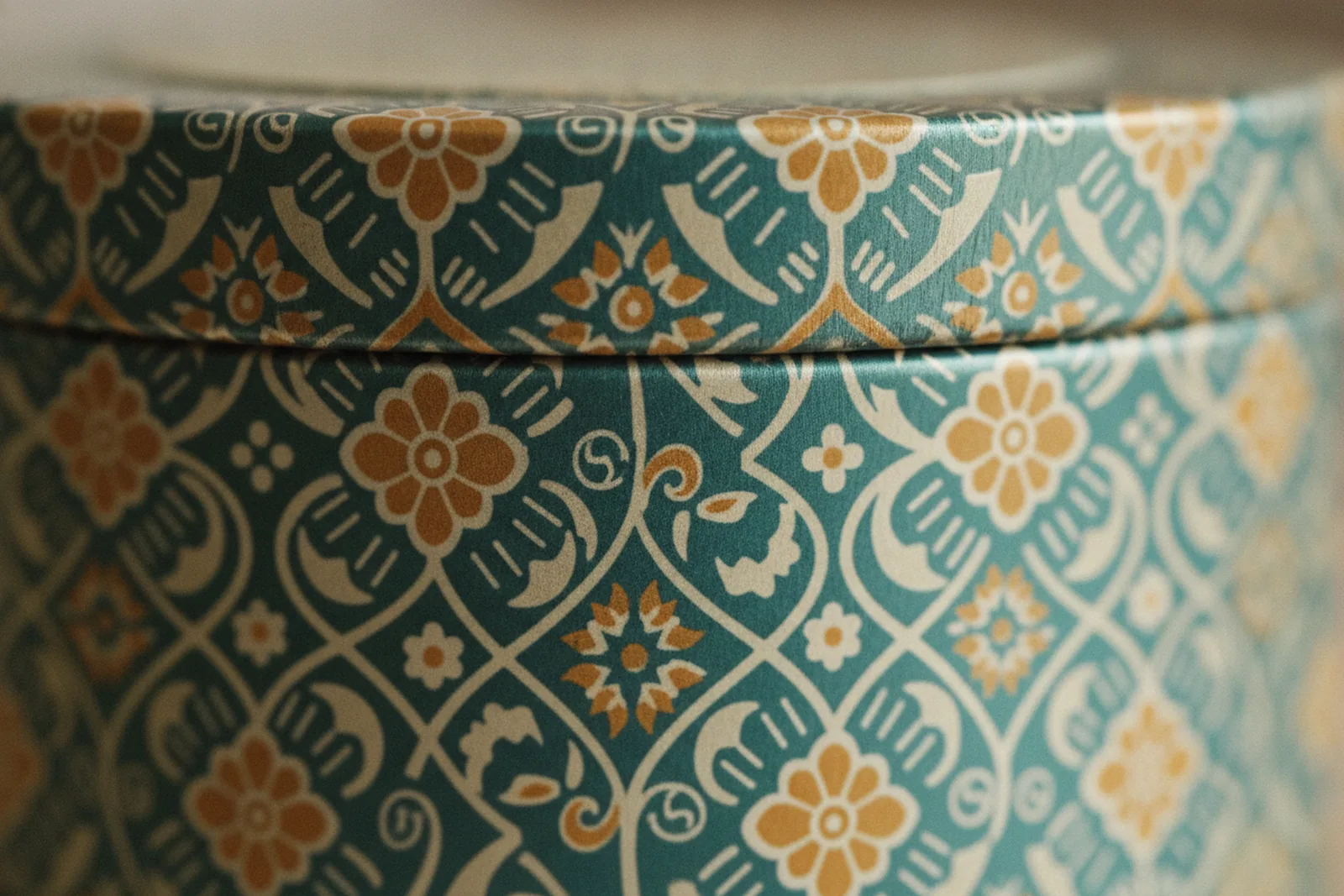
A decorative tin doesn't have that problem, because the artwork is printed directly onto the metal before the can is formed. The full-surface offset lithography we run lays down CMYK plus Pantone spot colors — Pantone being the pre-mixed inks matched to an exact shade, which matters enormously when a heritage color has to be the right red and not merely a close one — across the entire wrap of the can, edge to edge, with no paper label and no seam to interrupt the pattern. A tartan can be a continuous weave all the way around. A folk border can circle the body unbroken. An indigo wave motif can flow without a paper join cutting across the crest.
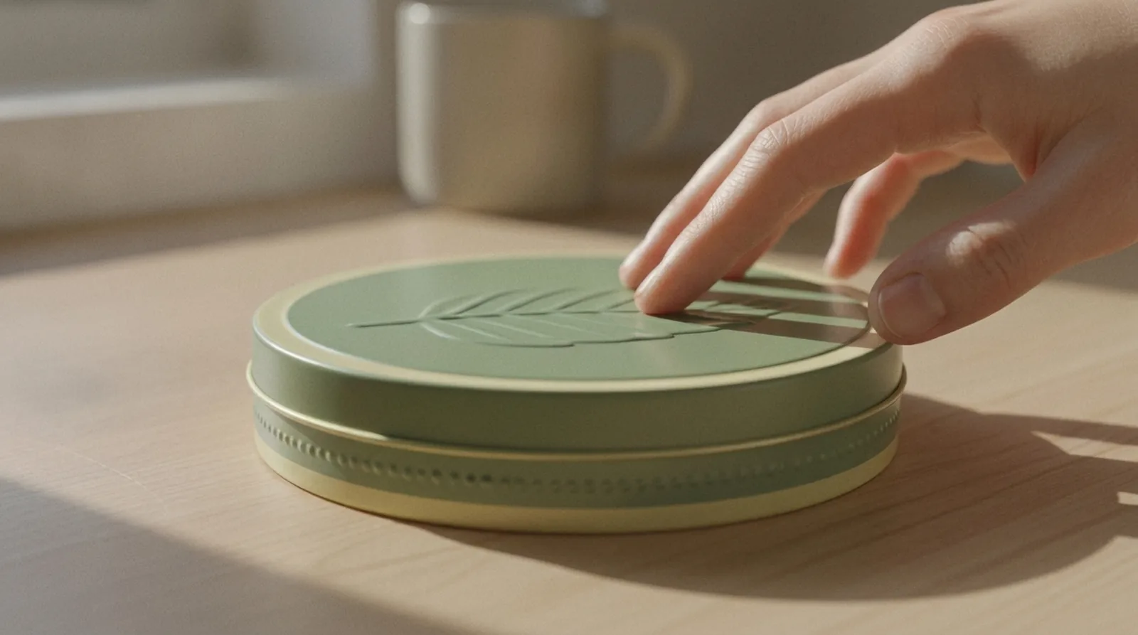
That continuity is the whole point of cultural artwork. These patterns are, almost by definition, repeating and directional — they're textiles, tilework, woodblock prints, things designed to flow. Give them a surface with a seam and you've fought the artwork. Give them a tin and you've handed them the canvas they were built for. Add embossing or debossing — raising the linework of a pattern into actual relief, so the design has texture you can feel as well as see — and a flat heritage motif becomes something closer to the woven or carved original it's referencing. A tartan that's slightly raised reads as cloth. A repoussé-style border that catches the light reads as metalwork. The medium starts doing some of the storytelling on its own.
It's also worth being clear about where tin doesn't help. If your "heritage" is three weeks old and your motif was chosen off a moodboard last Tuesday, a seamless wrap won't rescue it — it'll just make the thinness more visible at a larger scale. The format rewards a real story and exposes a fake one. That's a feature, not a bug, but it's worth knowing going in.
Doing it well, not just doing it
Because the format exposes thin stories, the brief matters more than usual. A few things we see often enough to flag.
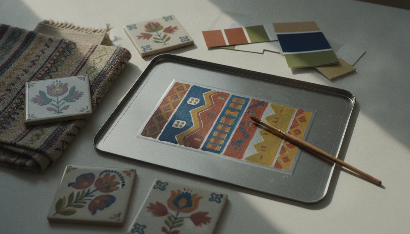
Start with authorship, not aesthetics. The question isn't "what culture looks good on a tin" — it's "what's genuinely ours, and how do we render it with respect." A family recipe from a specific region, a craft tradition the founder actually trained in, a motif with a documented meaning rather than a decorative one: these earn the right to wrap the can. If the heritage is real, name it, and let the design draw from primary references — actual textiles, actual tilework, actual archival pattern — rather than a generic "ethnic" pastiche. The Walker's tartan works because it maps to a real river and a real clan. The Pueblo design works because it comes from the village it depicts.
Translate, don't transplant. A pattern designed for woven cloth or glazed ceramic doesn't automatically sit right on a curved metal surface at packaging scale. The repeat that looks balanced on a two-meter bolt of fabric can feel cramped or busy shrunk onto a 72mm-tall tin. Part of the design work — and part of what an in-house studio earns its keep on — is adjusting the scale, spacing, and color separation of a heritage motif so it reads cleanly at the size it'll actually be printed, without losing what made it specific.
Mind the structural zones. As with any tin artwork, the lid, the body, and the rim behave differently, and intricate detail behaves worst on the curved lip where the metal forms. A dense heritage border that's gorgeous on the flat body of the can can turn to mud if it's forced around a tight curve. The fix is usually compositional: let the pattern breathe on the surfaces that hold detail, and simplify it where the geometry gets unforgiving. Guesses in manufacturing rarely end well, so this is a conversation to have at the die-line stage, not after the first proof comes off the line.
Let the color carry meaning. Heritage palettes are rarely arbitrary — the indigo, the ochre, the specific red all tend to mean something in their original context. Holding those colors precisely is exactly what Pantone matching is for. It's the difference between a design that nods at a tradition and one that actually belongs to it.
The quiet advantage
There's a strategic reason this trend has staying power, and it's not nostalgia. Cultural provenance is one of the few brand assets that's genuinely hard to copy. A competitor can match your minimalism in an afternoon. They can't borrow your river, your clan, your village, your hundred-and-fifty-year-old workshop. For Gen Z buyers in particular, that rooted specificity reads as authenticity in a way no minimal wordmark can. Regional art, indigenous craft traditions, calligraphy, and hyperlocal storytelling create an emotional specificity that no AI tool can generate and no multinational can buy.
For a brand with a real story, the format question almost answers itself. The artwork wants to flow without seams, hold an exact heritage color, and carry the tactile weight of the craft it's referencing. That's a tin. It always was — the rest of the market is simply remembering why.
FAQ
What is cultural provenance in packaging design?
Cultural provenance is the use of region-specific visual language — heritage patterns, local craft traditions, indigenous motifs, regional color palettes, even local dialect — to ground a product in a specific place and culture. In 2026 it's emerged as a leading design direction, valued precisely because it carries an emotional specificity that generic, AI-generated templates can't replicate. The point is authenticity of origin, not decoration.
Why is tin well suited to cultural and heritage artwork?
Because a decorative tin is printed directly on the metal before the can is formed, full-surface offset lithography can wrap artwork edge to edge with no paper label and no seam to interrupt the pattern. Heritage motifs are usually repeating and directional — textiles, tilework, woodblock prints — so a continuous, unbroken surface lets them flow the way they were designed to. Embossing and debossing can also raise the linework into physical relief, giving a woven or carved pattern real tactile texture.
Isn't using cultural motifs a risk of appropriation?
It can be, which is why authorship matters more than aesthetics. The working distinction is between cultural expression — drawing on a heritage that's genuinely yours, or doing so with real community involvement and credit — and decorative borrowing of a motif simply because it looks exotic. A documented, meaningful connection to the tradition is what separates a design that belongs to a culture from one that merely lifts from it.
How do you adapt a heritage pattern designed for fabric or ceramic onto a tin?
The repeat, scale, and color separation usually need adjustment. A pattern balanced on a large bolt of cloth can feel cramped shrunk onto a tin only a few centimeters tall, and intricate detail behaves worst on curved surfaces like the lid lip. The fix is compositional — let the pattern breathe on the flat surfaces that hold detail and simplify it where the geometry tightens — and it's best worked out at the die-line stage rather than after the first proof.
Are these heritage tin examples real or modern marketing?
Both, and that's the point. Scottish shortbread tartan tins, Japanese tinplate tea caddies (chazutsu), and Dutch, German, and English biscuit and toffee tins have carried regional identity for well over a century — Kaikado has hand-made tinplate caddies in Kyoto since 1875. The 2026 trend isn't inventing the idea; it's the broader market rediscovering what decorative tin has always done well.
Where this leaves a brand with a story
If you're working through how a heritage motif might wrap a custom decorative tin — the scale, the color matching, where the pattern should breathe and where it should simplify — that translation is most of what our design studio does, and it starts with the die-line. For how those colors actually get held on metal, the printing side covers the CMYK and Pantone work; for a sense of the range of finishes and shapes a story can live on, the gallery is the place to start. And if you already know the story you want to tell, tell us — the tin is the easy part.