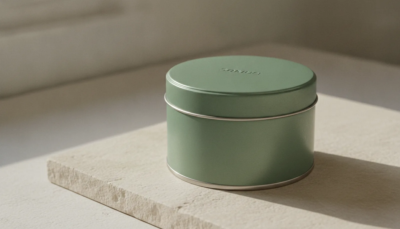
Pick up two gift packages of the same size and you can usually tell within a second which one cost more — and it isn't always the louder one. Lately it's almost never the louder one. The package wrapped in glossy laminate, finished with a printed faux-ribbon and a logo sized to be seen from across the room, increasingly reads as trying too hard. The plain one — a single matte tone, one small mark, real weight in the hand — reads as the expensive one. That instinct has a name now — quiet luxury packaging — and it's reorganising how premium brands think about everything from cosmetics boxes to gift tins.
"Quiet luxury" started as a fashion idea: the very expensive piece that carries no visible logo, the wealth that doesn't announce itself. By 2026 it had moved firmly into packaging. Across the design press, the same shift keeps showing up under slightly different names — quiet luxury, lightweight luxury, stealth wealth — but the underlying move is identical. Luxury is increasingly communicated through material quality and craft precision rather than the volume of decoration. The palette shrinks to what designers are now calling expensive neutrals: sand, slate, charcoal, bone. The logo shrinks with it, sometimes to a micro-mark, sometimes to nothing but a debossed impression you have to tilt toward the light to read. The investment that used to go into surface ornament goes instead into what you can touch.
It's worth saying where this idea actually comes from, because it predates the trend cycle by sixty years. "Less but better" — Weniger, aber besser — was the design ethos of Dieter Rams, the German industrial designer behind Braun's most enduring products and the author of the ten principles of good design. Rams argued that good design is unobtrusive, honest, long-lasting, and "as little design as possible," because the best objects concentrate on the essential and aren't burdened with non-essentials. What's happening in packaging right now is, in a sense, his argument finally arriving at the gift aisle. And once you frame it that way, a particular material starts to look less like one option among many and more like the obvious one.
Why restraint is harder than excess
Here's the thing most people get backwards about minimal packaging: it is not the easy version. Decoration hides flaws. A busy printed pattern, a layer of high-gloss laminate, a foil flood across the whole lid — these are all very good at covering up a substrate that doesn't feel like much on its own. Take the decoration away and the material has nowhere to hide. Every honest minimalist package is making a quiet bet that the thing underneath the design can carry the design's entire weight.
That's exactly why the trend favours certain materials and quietly punishes others. A thin plastic clamshell with the graphics stripped off doesn't read as elegant restraint — it reads as cheap, because it is. The restraint only flatters a substrate that has genuine presence to begin with. Quiet luxury is, in practice, a material confidence test. The brands that pass it are the ones whose packaging can lose the costume and still command the room.
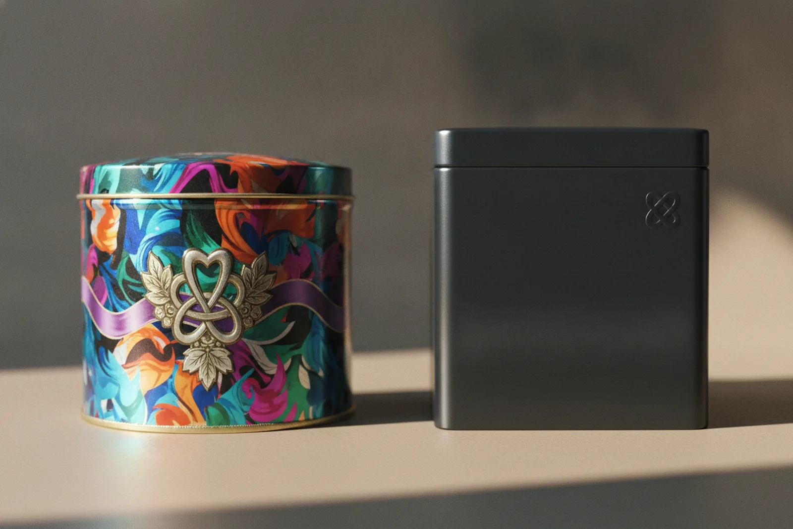
This is where the conversation tends to drift away from over-laminated cardboard and over-moulded plastic — the formats that have leaned hardest on surface effects to feel premium — and toward metal. Not because tin is fashionable, but because tin is one of the few packaging materials that was already doing what the trend now asks of everything.
What metal brings to "less but better"
A custom decorative tin starts from a position the trend is trying to reach. It has weight — real, cold, reassuring heft that a reader's hand registers before their eyes do, and weight is one of the most reliable cues of quality we have. It has a rigid structure that holds its shape and opens with a clean, satisfying resistance rather than the flex and rattle of a thin-walled box. And its surface can be finished to a dead-flat matte that reads as deliberate rather than default. None of that depends on a single printed graphic. It's the material talking.
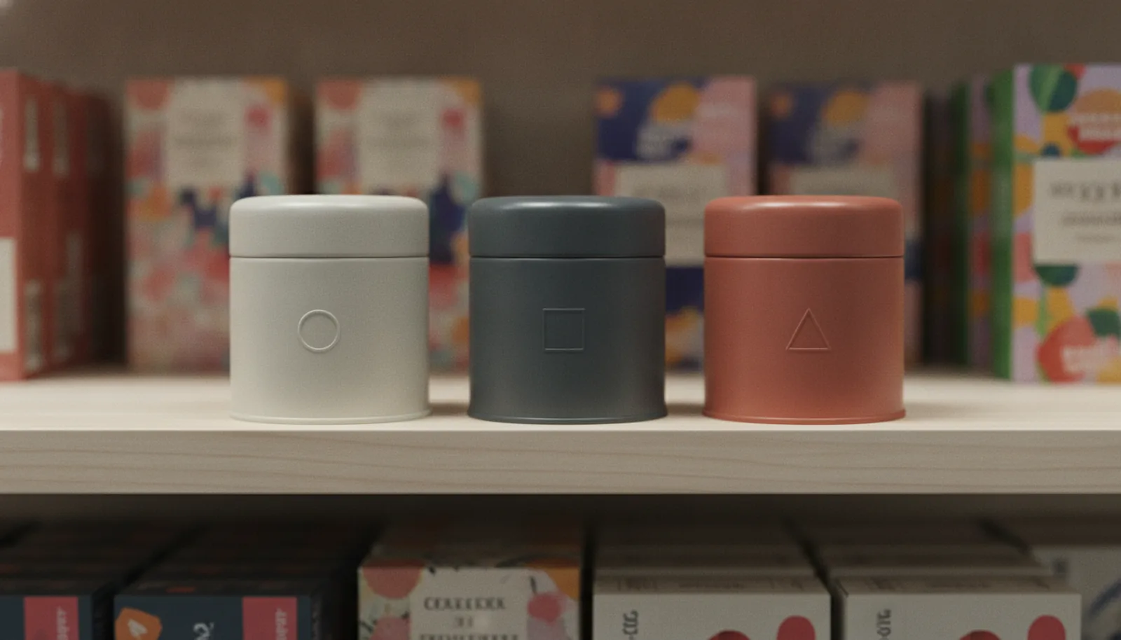
Then there's the detail that does most of the quiet-luxury work: the debossed mark. There's a meaningful difference between embossing and debossing — embossing raises a logo or pattern off the surface; debossing presses it in. On a metal lid, a debossed wordmark is tone-on-tone — the same colour as everything around it, legible only because the metal steps down into the impression and catches a thin line of shadow at the shoulder. There's no ink, no contrast, no shouting. You read it the way you read a watermark or a blind-stamped book cover: by touch and by light rather than by colour. It is about as close to "the logo that isn't a logo" as packaging gets, and on Stannum Can's lines it's achievable to roughly 1mm of tooling and embossing precision, which is what keeps the edges crisp enough to read cleanly.
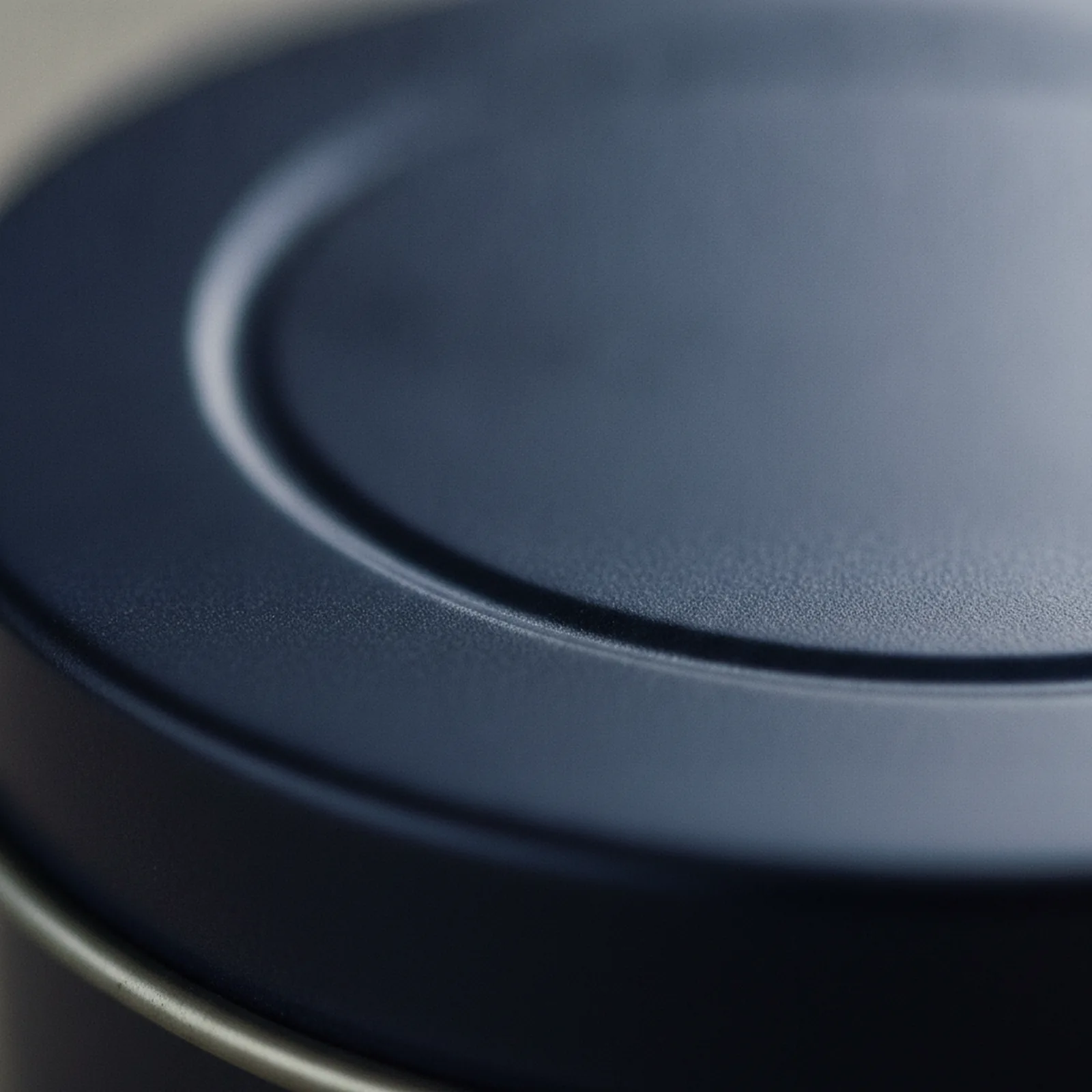
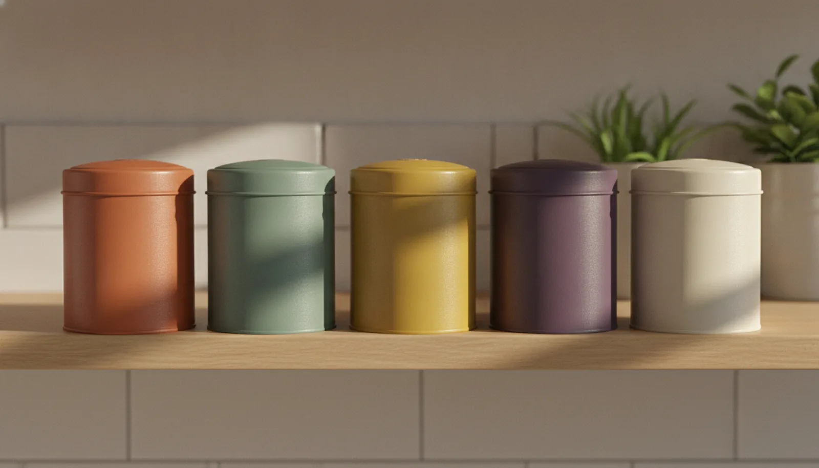
The finish does the rest. A full-surface matte offset litho in a single expensive neutral — a deep charcoal, a muted sage, a warm bone — gives you a tin that is essentially one considered colour and one tactile mark. No overwrap. No plastic window cut into the lid. No gloss flood catching the overhead lights. Just the form and the feel. If you've read our piece on choosing the right tin finish, you already know matte and soft-touch coatings are doing a lot of the heavy lifting in premium tin right now, and quiet luxury is the clearest expression yet of why.
The over-decorated package is becoming a liability
For a long stretch, more was the safe default. More laminate, more foil, more print passes, a plastic window so buyers could see in, an overwrap so the whole thing arrived sealed and shiny. Each addition was a small insurance policy against looking cheap. The trend has inverted that logic. To a design-literate buyer in 2026 — and that increasingly describes the brand managers and product teams making packaging decisions — every extra layer now reads as a small confession that the core wasn't enough on its own.
There's a sustainability dimension to this that isn't incidental, because the same buyers who want restraint also want recyclability, and over-decoration tends to work against both. A plastic window laminated into a paperboard lid is a multi-material problem at end of life. A gloss film over print is one more thing a recycler has to deal with. Strip those away and you're not only chasing a cleaner look — you're chasing a cleaner material story. Tin happens to give you both at once. Steel packaging is infinitely recyclable without any loss of quality, and in the EU steel sits at 84% recycling in 2024 — comfortably the most recycled packaging material on the continent. The restraint that makes a tin look more expensive is the same restraint that makes it easier to recycle. That's a rare case of an aesthetic trend and a material fact pulling in the same direction.

FAQ
What colours actually count as "expensive neutrals" for quiet luxury packaging?
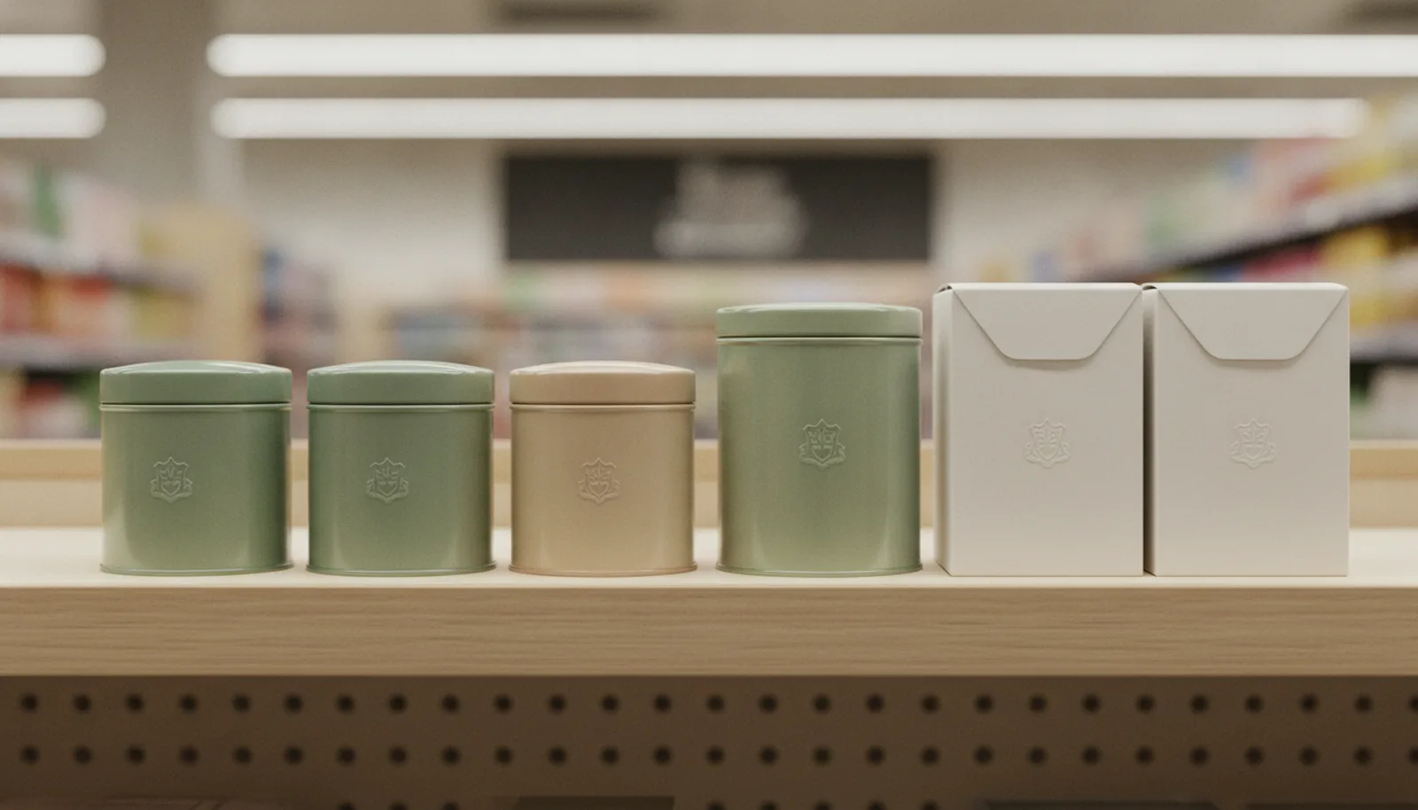
The shorthand list is sand, slate, charcoal, and bone — and on tin lines, deep charcoals, muted sages, and warm bone tones are doing most of the work in current premium projects. The point isn't the specific swatch but a single muted tone that reads as deliberate rather than decorative. Matching it to a Pantone spot is what keeps the colour from drifting between batches and undermining the restraint.
Is quiet luxury packaging just a passing trend?
The "quiet luxury" name is recent, but the underlying argument — Dieter Rams' "less but better" — has been around since the 1960s and shaped some of the most enduring product design of the last century. What's happening now is that argument finally arriving at the gift aisle, not a fresh aesthetic likely to expire with the next style cycle. The names rotating around it may change; the underlying preference for material honesty over surface decoration tends to compound.
Can a minimalist luxury tin still have a clear window in the lid?
Technically yes, but it usually defeats the point. A plastic window cut into a metal lid breaks the single-material story, introduces a multi-material recycling problem, and visually interrupts the one quiet surface the design is supposed to be carrying. If buyers genuinely need to see the product before opening, that's a different brief — trying to combine restraint with a window typically lands somewhere short of both.
Why does weight matter so much for perceived quality?
A reader's hand registers weight before their eyes finish reading the logo or finish, and substantial heft is one of the most consistent unconscious cues of quality we have. That's part of why tin holds up under stripped-back decoration — there's real mass behind the matte surface, so restraint reads as confidence rather than absence. Lighter formats are at more of a disadvantage once the graphics come off, because the substrate has less of its own presence to fall back on.
How precise does the tooling have to be for a debossed logo to read cleanly?
For tone-on-tone debossing to work — where the mark is legible only by depth and shadow, not colour — the impression has to hold a crisp shoulder. On our lines that comes down to roughly 1mm of tooling and embossing precision, which is what keeps the edges sharp enough for the eye to catch the shadow line at the step-down. A softer or wandering edge tends to read as a manufacturing slip rather than an intentional minimalist mark.
Designing for quiet luxury packaging
The practical translation of quiet luxury packaging into a tin brief is shorter than most briefs, which is the point. Pick one colour and commit to it — an expensive neutral, matched to a Pantone spot so it's consistent across runs rather than drifting between batches. Resist the second colour unless it genuinely earns its place. Move the logo from "printed and large" to "debossed and small," and let the impression do the work that ink used to. Skip the plastic window; if the product needs to be seen, that's a different brief, and trying to have both restraint and a window usually means getting neither. Let the weight of the metal and the flatness of the finish carry the prestige, because in a quiet-luxury frame they will. We've written before on why minimalist designs tend to outlast bold ones on shelf, and quiet luxury is the sharpest version of that argument yet.
The one honest caveat: restraint is unforgiving of imperfection. When there's a single mark on a flat field, that mark has to be perfect — a soft deboss, a misregistered edge, a finish that's matte in some spots and not others will read as a mistake rather than a choice, precisely because there's nothing else for the eye to forgive it against. This is the trade-off the trend asks you to accept. Quiet luxury removes the decoration that used to cover small flaws, which raises the bar on everything that's left. It's a good bar to be held to, but it's worth knowing it's there before you commit to a design with nowhere to hide.
That's most of what we do here — custom decorative tins where the material is meant to be the message, finished to the tolerances that let a single debossed mark actually read. If you're working on a package that's trying to say "expensive" without saying much at all, you can see the range of finishes and forms in our work, or tell us what you're making and we'll talk through how to do less, better.
References
1. Premium Packaging Design Trends 2026 — QinPrinting
2. Luxury Packaging Trends in 2026 — CustomRigidBoxes
3. 10 Notable Packaging Trends for 2026 (Dieter Rams / "less but better") — VistaPrint
4. Packaging Design Trends 2026: lightweight luxury — Zenpack
5. Dieter Rams' Ten Principles of Good Design — Vitsœ
6. Steel for Packaging Europe — EU steel packaging recycling rate (84%, 2024)