Photogenic Packaging: Boost Your Brand Visibility
In a world ruled by images, your packaging isn't just seen—it's shared. From TikTok unboxings to Instagram flat-lays, your product's packaging is constantly being judged through a lens. And when you use tin packaging or metal packaging, you unlock a visual edge: clean lines, reflective surfaces, and photogenic finishes that demand attention.
Why Photogenic Packaging Matters
- User-Generated Content = Free Marketing
- Better DTC Conversions (especially for lifestyle products)
- Shelf-to-Social Strategy (Retail packaging needs to stand out in both physical and digital spaces)
Your product's first impression often happens online—not on the shelf.
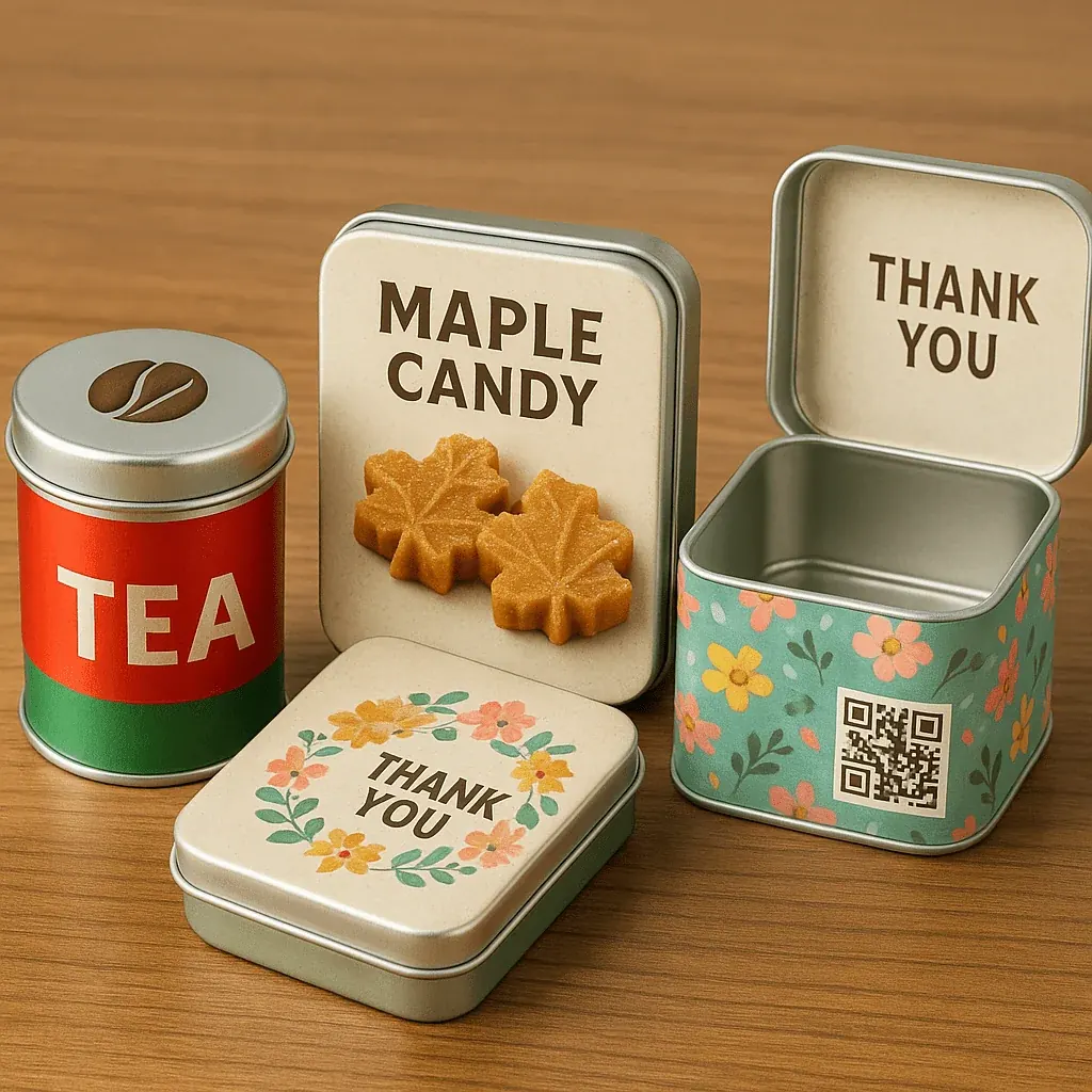
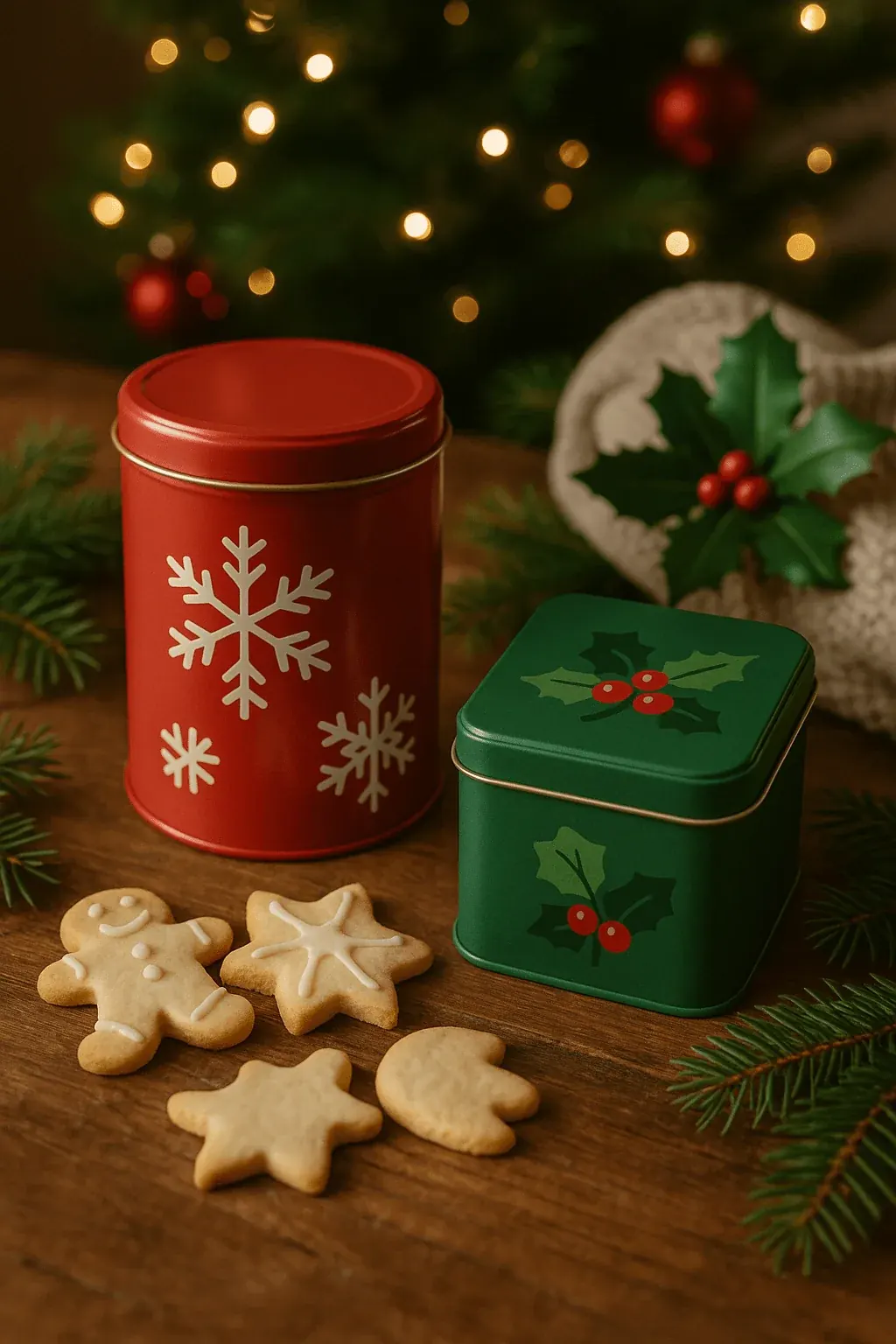
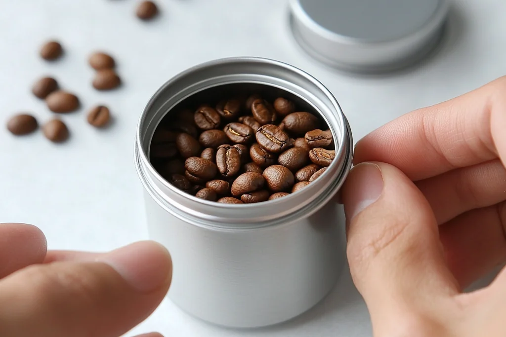
Tin: The Most Photogenic Packaging Material
Not all packaging materials are created equal when it comes to camera-readiness. Why Tin Packaging Works So Well:
- Reflective and Sculptural: Catches light in a dynamic way—great for product shots.
- Sturdy & Shape-Retaining: Keeps structure for flat-lays, reels, and display setups.
- Luxurious Feel: Adds instant value in perceived quality.
Whether it's a cookie tin, a custom printed tin, or a metal candy box, tin's glossy, matte, or embossed surfaces allow for visual storytelling that pops.
Finishes That Pop On Camera
- Glossy: Reflects light dramatically. Best For: Premium sweets, gift packaging.
- Matte: Soft, even surface. Best For: Minimalist cosmetics, wellness.
- Embossed/Debossed: Adds depth and tactile interest. Best For: Luxury teas, chocolate packaging.
- Spot UV or Foil: Creates light-catching accents. Best For: Candle containers, high-end DTC.
Tip: Always test your tin prototypes under both studio and natural lighting before finalizing.
Packaging Design = Social Design
Every great piece of packaging design today is also a piece of content strategy.
Design With Lighting in Mind: Metallics amplify contrast—use that to create drama. Avoid overly busy backgrounds that reflect chaotically.
Logo Placement & Typography: Keep brand marks clean, bold, and central. Serif fonts on matte tins = elegance. Sans-serif on glossy = bold and modern.
Think in Square Format: Instagram crops square first—center your key design elements accordingly.
The Ripple Effect: Better Photos = Better Business
Great packaging photography leads to:
- More UGC (User-Generated Content)
- Increased SEO visibility (via image search)
- Higher conversion rates on DTC platforms
- More brand shares and saves on Pinterest & Instagram