Sustainability Insights
Designing Tins for Effective Storytelling Packaging Design
Packaging design is more than logos and taglines. For tin packaging, shape speaks louder than words. Form, silhouette, motifs, and symbolism can whisper—or shout—your brand message long before a consumer ever reads the label. Let's explore how tins communicate without saying a single word—and how you can harness that power to craft iconic packaging that customers remember and keep.
Why Wordless Design Works
Minimalism is trending. But silence isn't emptiness—it's focus. Without a single line of copy, a well-designed tin can still express: Emotion (romance, luxury, nostalgia), Product identity (chocolate, tea, cosmetics), Brand values (eco-conscious, heritage, fun). Through carefully considered tin packaging, you can turn each piece into a visual narrative that resonates.
1. Shape: The Unsung Hero of Storytelling
Form Equals Function—and Message. Shape is the first thing a consumer notices. Is it a smooth circle? A sharp-edged rectangle? A whimsical custom shape? Each has its own emotional cue.
- Heart-shaped tins say love, giftable, or limited-edition.
- Book-shaped tins evoke storytelling, nostalgia, or premium collectible design.
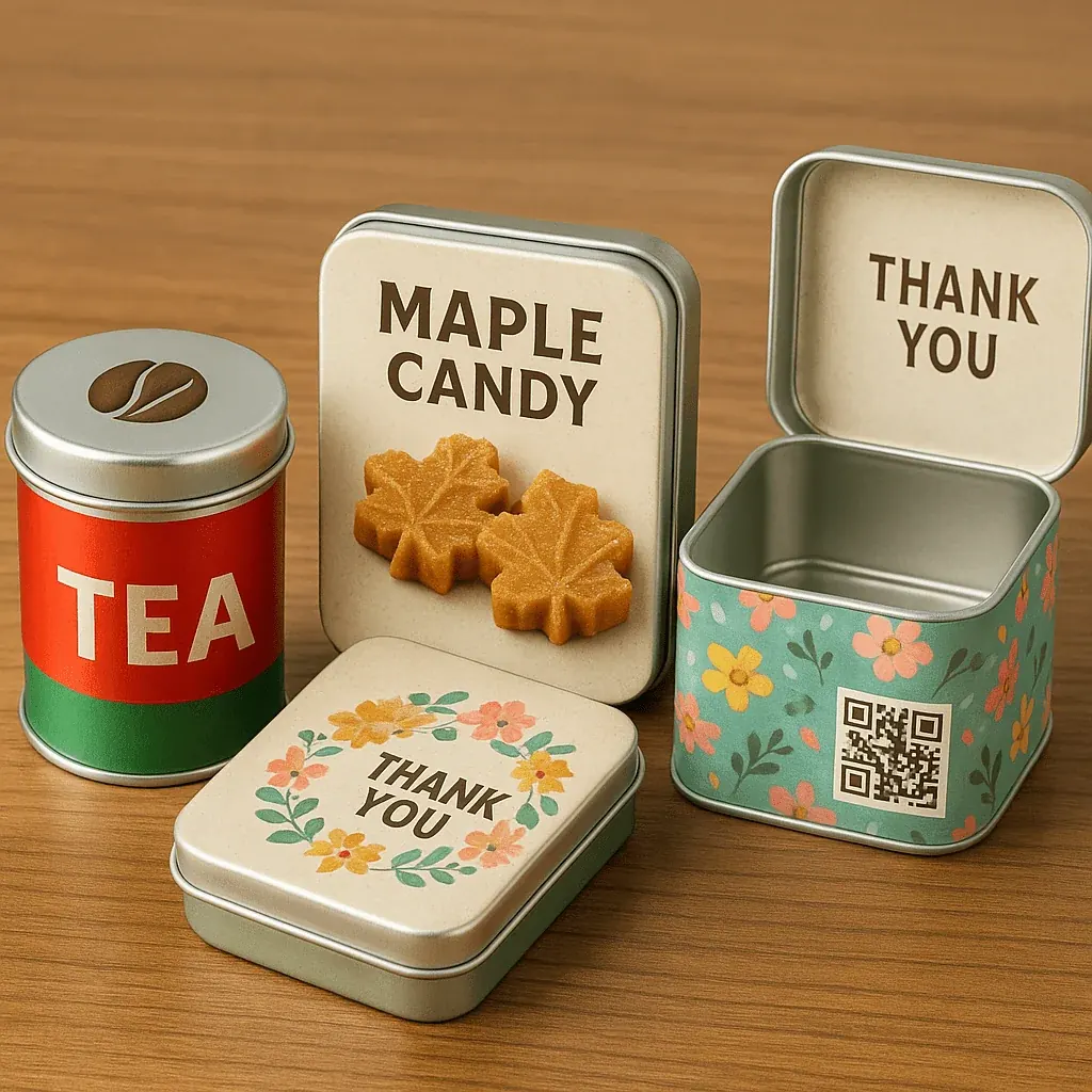
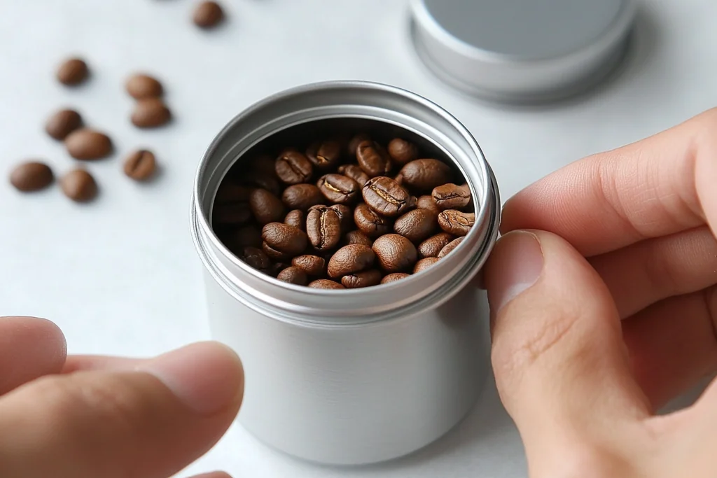
- Tall cylindrical tins convey sophistication or premium tea packaging.
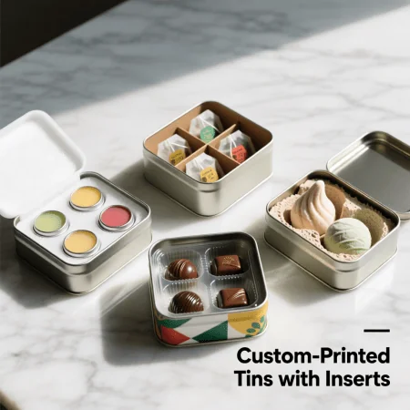
- Mini flat tins imply portability, modern design, or daily ritual (think mints or balm).
A tall rectangular candle container with beveled edges might speak elegance and interior luxury, while a squat cookie packaging tin in a soft round form can feel warm, comforting, and shareable.
2. Silhouette: The Mood Maker
Silhouette isn't just the outline—it's the emotional tone of your tin. A bold, blocky silhouette often feels industrial or masculine—great for metal packaging used in grooming or tool gift sets. Meanwhile, a curved, feminine silhouette with rounded edges softens the overall aesthetic—perfect for cosmetic packaging.
Pro tip: In retail environments or gift shops, your tin's silhouette is often what gets photographed, shared, or picked up—especially when labels are subtle.
3. Motifs & Symbols: Your Silent Brand Language
Visual motifs act like memory triggers. No words needed.
- A pressed botanical motif equals organic, eco-conscious, wellness.
- A moon/star motif equals dreamy, calming, spiritual (great for candles or bath soaks).
- Stitch or embroidery pattern equals handmade, crafted, vintage appeal.
- Mirror finishes equals vanity, premium skincare, reflective luxury.
Metal tin boxes are ideal for embossed motifs, giving depth and tactile storytelling.
4. Symbolism in Material & Finish
- Brushed matte finish equals contemporary, clean beauty, minimalism.
- High-gloss with gold accents equals festive, indulgent, celebratory.
- Bare metal with rougher finish equals industrial, artisanal, eco-authentic.
Pair this with recyclable or biodegradable packaging elements, and you've instantly communicated sustainability—without shouting it.
5. Case Study Examples (No Text, Strong Story)
Heart-Shaped Tin for Valentine's Day Candles: No logo. Just a matte blush tin with gold rim. That shape alone said gift me. Result: Customers reused it for love notes and jewelry storage.
Tea Tin with Herbal Leaf Motif: A cylindrical tea packaging container embossed with vines and natural textures. No text—just tactile storytelling. Result: Boosted perceived value and shelf presence.
Cosmetic Balm Tin with Crescent Moon: Soft silver finish, debossed moon and stars. No product name on top. Result: Viral on Instagram. Reused as jewelry keeper and shown in UGC posts.
6. Design Tips: Telling Stories Without Text
- Choose form like you'd cast a character.
- Use symmetry and silhouette smartly.
- Let motifs do the heavy lifting.
- Think about distance perception.
- Focus on mood, not message.
Final Thoughts
In an age of visual overload, wordless design is powerful. Tin packaging provides the perfect medium—structured, long-lasting, and easy to sculpt into meaning. Sometimes, the best stories are the ones you don't need to read.