The Psychology of Color in Metal Packaging
Color isn't just a design decision—it's a powerful psychological tool that influences how consumers feel, think, and act. In the realm of tin packaging and metal packaging, where durability meets elegance, color choices can make or break a product's shelf appeal.
Why Color Matters in Metal Packaging
First impressions happen in 90 seconds, and up to 90% of that judgment is based on color alone. In metal packaging, where the surface finish interacts with light, color can either elevate a product—or make it disappear.
The Power of Color in Packaging Design
Using the right color psychology in your tin box design can:
- Increase product visibility
- Enhance perceived value
- Encourage brand loyalty
- Influence purchasing decisions
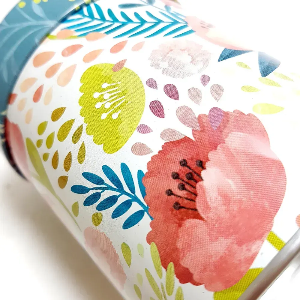
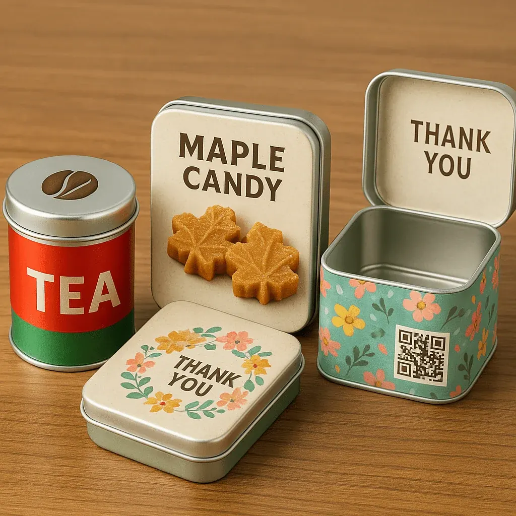
Red: Urgency & Appetite
Red is associated with energy, excitement, and appetite. That's why it's often used in cookie packaging, candy tins, and limited-edition holiday tins.
- Use with glossy or embossed finishes for boldness
- Ideal for promotions, snacks, or luxury seasonal gifts
- Stimulates impulse buying when paired with gold or black
Blue: Trust & Tranquility
Blue evokes trust, cleanliness, and serenity. Widely used in cosmetic packaging, tea packaging, and health-related products.
- Matte blue with silver = premium wellness look
- Deep navy with foil = elegance and reliability
- Light blue = calming teas or wellness kits
Green: Natural & Sustainable
Green screams eco-friendliness and health—perfect for brands promoting sustainable packaging.
- Pair with kraft textures or recycled tin finishes
- Use soft sage or olive green for artisan appeal
- Perfect for biodegradable packaging and organic tea tins
Black: Luxury & Sophistication
Black signals elegance, power, and exclusivity. When combined with metal packaging, it creates a high-end, minimalist vibe.
- Use for candle containers, premium chocolate tins, or VIP gift sets
- Black + gold = opulence
- Black + matte = modern luxe
White: Simplicity & Cleanliness
White is clean, crisp, and versatile. It offers a minimalist aesthetic often used in modern packaging design.
- Ideal for health, wellness, and cosmetic packaging
- Combined with silver or brushed tin = sleek, contemporary look
- Works beautifully with embossing or UV typography
Gold & Metallics: Premium & Festive
Metallic tones like gold, rose gold, and copper naturally elevate perceived value—especially in holiday packaging and luxury custom tins.
- Use for holiday collections or giftable formats
- Works well with tinplate finishes
- Pro tip: A gold debossed logo on matte black? That's visual prestige.
How to Choose the Right Color for Your Brand
Ask yourself:
- What emotion do you want your packaging to evoke?
- Who is your target audience—luxury buyers, eco-shoppers, or kids?
- Will your color stand out on the shelf or blend in?
How Finish Affects Color Perception
Finish changes everything. A red on matte tin looks deep and rich. The same red on glossy metal screams vibrance. Use embossing, debossing, or foil stamping to add tactile depth and make your colors feel more intentional.
Real-World Example: Tea Brand Rebrand
A premium tea brand switched from Kraft paper to custom metal tins in emerald green with copper foil. Result? Sales rose 38% in just six months. Why it worked: Green communicated their organic mission. Copper details added elegance and distinction. The metal tin added lasting keepsake value.
Final Thoughts: Color Is Your Silent Salesperson
Every custom packaging choice tells a story. With tin packaging, you gain more than durability—you unlock visual psychology, tactile engagement, and brand storytelling in one elegant form. Choose your colors wisely.