Minimalist or Bold? Best Tin Design Styles
When it comes to metal packaging, your design choice isn't just about aesthetics—it's about making a statement, creating a connection, and telling your brand's story. But should you go for serene simplicity or eye-popping flair?
Minimalist Designs: Less is More
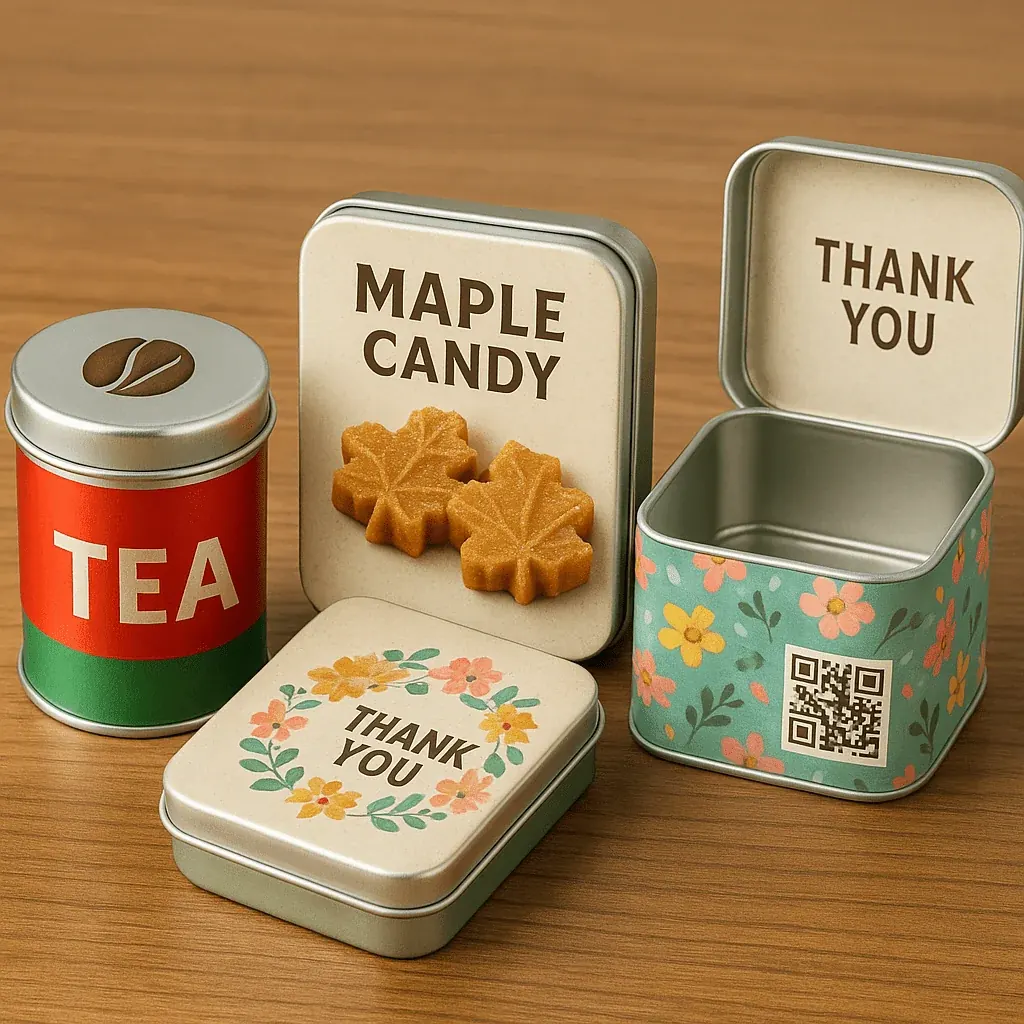
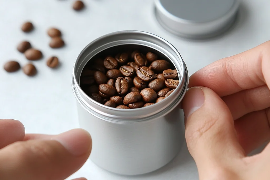
Minimalist tin packaging is all about elegance through restraint. Clean lines, subtle color palettes, refined typography, and soft finishes like matte or brushed metal help build a premium feel.
Why it works: Minimalism evokes trust, calm, and sophistication. It lets the product speak for itself and appeals to consumers who appreciate thoughtful, modern design.
Best for:
- High-end or luxury goods (designer candles, premium tea, limited-edition cosmetics)
- Wellness and organic brands that want to communicate simplicity and clarity
- Eco-conscious labels seeking low-ink, sustainable aesthetics
- Gift collections where the packaging doubles as a keepsake
Pro Tip: Use embossing or spot UV on minimalist tins to add texture without clutter.
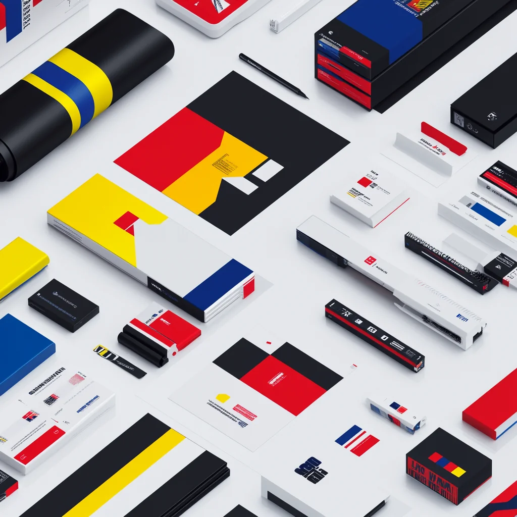
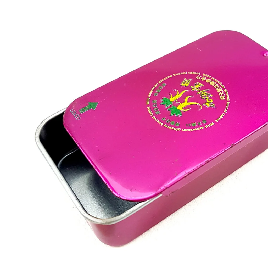
Bold Designs: More is More
On the other side of the design spectrum, bold tin packaging is all about making an instant impression. Bright hues, loud graphics, playful fonts, and glossy finishes command attention and create excitement.
Why it works: This approach thrives in competitive retail environments where standing out matters most.
Best for:
- Youth-focused brands (energy drinks, funky snack lines)
- Seasonal promotions and limited runs (Halloween candy, holiday cookie tins)
- Collaborations with artists or pop culture icons
- High-traffic retail displays like airports, convenience stores, or department stores
Pro Tip: Try limited edition bold designs for seasonal drops or social media campaigns to drive buzz and urgency.
So, Which Should You Choose?
- If your brand embodies calm, quality, and timelessness → Go minimalist.
- If your brand is expressive, playful, and fast-moving → Go bold.
But here's the twist: you don't have to choose one forever. Some of the most successful tin packaging lines mix both styles strategically:
- A matte black tin (minimalist base) with a colorful lid insert (bold pop)
- A clean layout on the front with a surprise graphic on the inside
- Collectible tin series that alternate between minimal and bold designs
Case Study: Brands like Whittard of Chelsea and Ladurée often play with both ends of the spectrum—offering classic, understated tins alongside vibrant seasonal or souvenir editions.
Final Thought
Tin packaging isn't just a container—it's part of your product experience. Whether you choose a minimalist or bold approach (or a hybrid), what matters most is consistency with your brand's values, your target audience, and the message you want to leave behind.