The finish on a tin isn't just a cosmetic decision. It affects how the packaging photographs, how it feels in hand, and the price signals it sends to customers before they've even opened it.
Matte Finish
Matte is the go-to for premium and minimalist brands. It reduces glare in photography, feels soft to the touch, and reads as understated luxury. It works especially well for beauty, candle, and high-end food brands.
The tradeoff: matte surfaces show fingerprints more easily and can feel less vibrant in retail lighting compared to gloss.
Gloss Finish
Gloss maximises colour saturation and creates a bright, eye-catching shelf presence. It's the default for most mass-market tins — confectionery, holiday collections, and anything that needs to compete for attention at distance.
Gloss also photographs well under studio lighting, making it a strong choice if the packaging will feature heavily in marketing materials.
Satin Finish
Satin sits between matte and gloss — a subtle sheen that reads as polished without being loud. It's increasingly popular for brands that want a premium look without the austerity of pure matte.
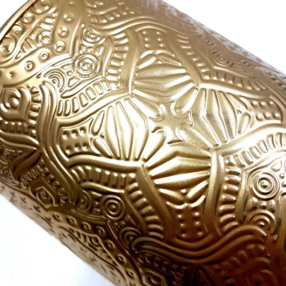
Textured Finishes
Embossing, debossing, and tactile coatings add a physical dimension to your packaging that photography can't fully capture — but customers remember. A subtle linen texture or a raised logo creates a moment of surprise at unboxing that builds brand loyalty.
How to Decide
- High-end or gift-positioned product: matte or satin
- Mass market or seasonal retail: gloss
- Collector or keepsake tin: embossed texture
- Photography-first brand: gloss or satin for studio, matte for lifestyle
Request a sample kit from Stannum Can to compare finishes in hand before committing to production.