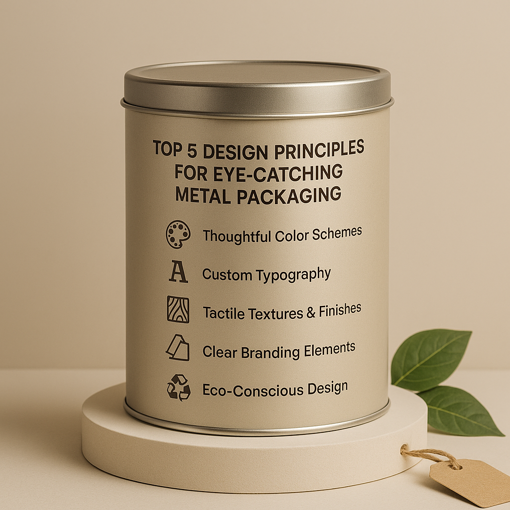
In today’s competitive marketplace, tin packaging isn’t just about protection—it’s about presentation, perception, and personality. Whether you’re packaging tea, cosmetics, or confections, a well-designed metal container can elevate your brand and drive sales. Let’s explore five essential design principles to make your metal packaging truly shine.
🎨 Thoughtful Color Schemes
Color isn’t just visual—it’s psychological. The hues you choose impact how consumers feel about your product.
- Bold contrasts, like black and gold, radiate luxury and high energy.
- Muted earth tones convey sustainability and a calm, premium appeal.
Stick to a tight palette of 2–3 primary colors. This focused approach enhances visual impact and brand recognition. In packaging design, less is often more.
🔤 Custom Typography
Typography tells a story before the words are even read.
- Choose elegant serif fonts for classic, upscale aesthetics (perfect for candle packaging or cosmetic tins).
- Use modern sans-serifs for clean minimalism, great for tea packaging or cookie tins.
💡 Tip: When working with curved metal surfaces, adjust kerning, line height, and font weight to maintain legibility. What looks good flat may behave differently on a cylindrical tin.
🪵 Tactile Textures & Finishes
Embossing and debossing add depth—visually and physically. These textures make your packaging interactive and memorable.
- Embossed logos feel premium and luxurious.
- Matte coatings feel soft and refined.
- Gloss finishes pop under lighting—ideal for chocolate packaging and custom printed tins.
Textures aren’t just decorative—they trigger sensory engagement, making customers more likely to remember (and repurchase) your product.
🏷️ Clear Branding Elements
Branding is more than a logo—it’s where, how, and why it appears.
- Place your logo, tagline, and core graphics where they align naturally with the tin’s structure—typically near the lid or on the main panel.
- Align design elements across your entire product line to build cohesive branding.
Your custom metal packaging becomes instantly recognizable when every touchpoint—from icon to finish—is consistent.
♻️ Eco-Conscious Design
Modern consumers want more than good design—they want good values.
- Highlight recyclability with clear ♻️ symbols, QR codes, or “100% reusable” stamps.
- Consider biodegradable packaging inserts inside your metal tin box to reduce waste.
Communicating sustainability builds emotional trust, and that trust translates into long-term brand loyalty.
It’s More Than a Container—It’s a Conversation Starter
Designing custom metal tins is a creative opportunity to communicate your brand story, values, and product quality in one cohesive visual experience. When you combine smart aesthetics with tactile experience and sustainable messaging, your tin becomes more than a container—it becomes a customer’s reason to choose you.
🔗 Internal & External Inspiration:
📣 Call-to-Action:
👉 Visit Stannumcan.com for the full blog & all the moulds